Visual Narrative

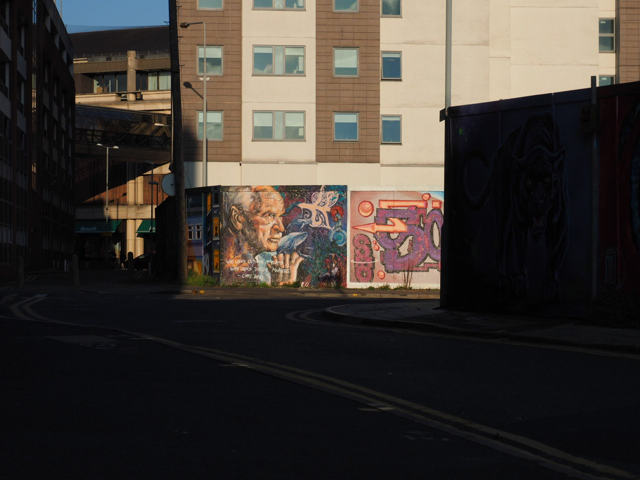
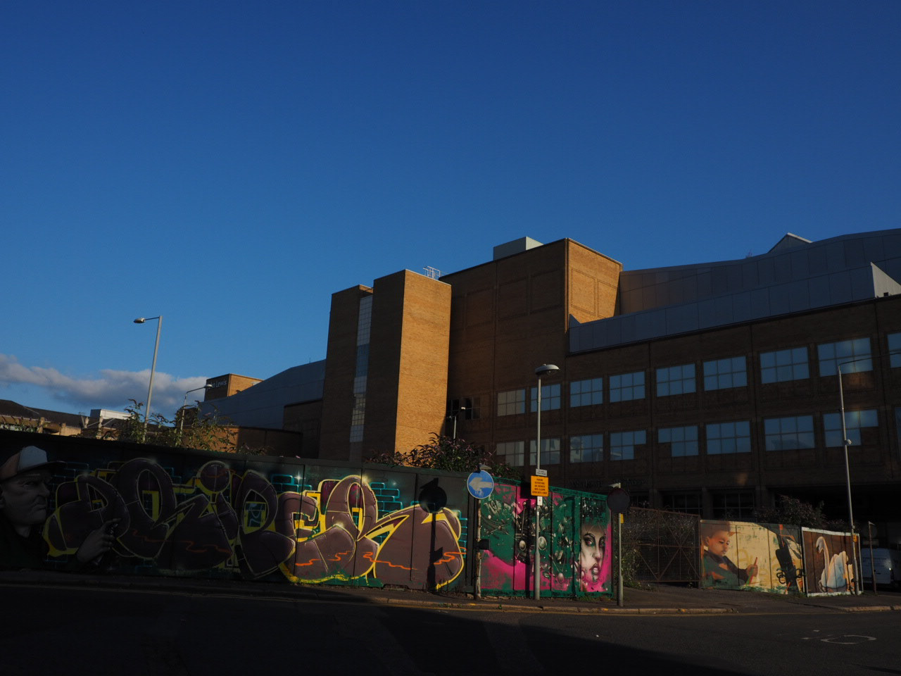
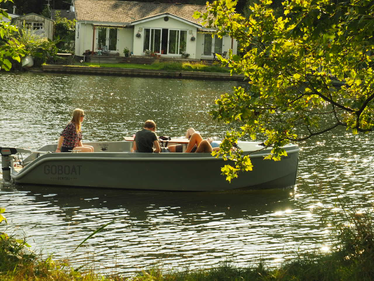
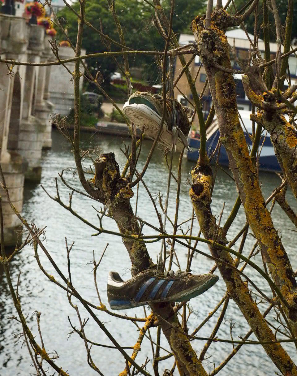
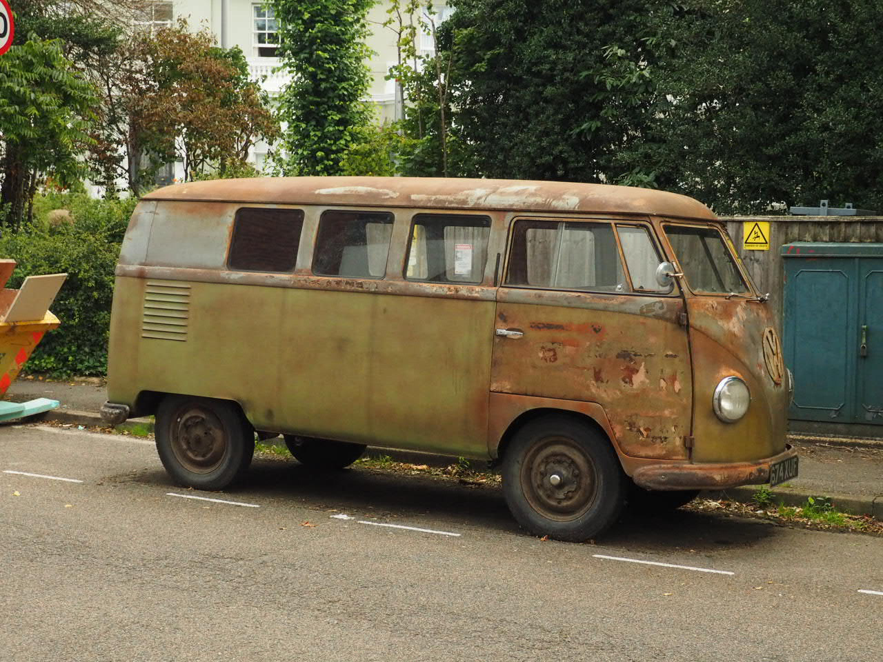
Pictures of Kingston/Surbiton
Create a 2D infographic based on the classes travel time to college.
This graph was inspired by the energy efficiency charts. As generally people who are travelling further have a larger C02 output on their journey. It also shows the patience of the students when traveling far distances.
Creating a 3D data object
Initial Idea
For this project I have decided to create a graph showing the travel times using autumnal leaves. As everyone on their journey notices this change this time of year no matter how long their journey. Taking inspiration from an artist called Andy Goldsworthy. He utilises nature around him to create images when photographed.
Andy Goldsworthy's Art
I then decided to create a pie chart using the figures given. The idea being each section of the chart could be different autumnal leaves.