Perfume Project
Identify brand DNA, identify the audience, create a perfume/aftershave based on these factors.
There were a few brands I wanted to work with for the perfume ad; Kidsuper, Liam Hodges, Norse Projects and Anderson Belle. I decided to focus on three brands who portray themselves differently to analyse and to gain an understanding of their aesthetic, also the way they portray a messages to their audience. Kidsuper and Norse Projects interested me most as they have very different brand aesthetics.
Kidsuper Mood-board
Kidsuper is a New York based brand based around the ideology of being able to do anything. Colm Dillane the founder describes the idea of the brand much like when dreaming what your dream job is when a child, for instance being an astronaut. That anything is possible, hence the name ''Kidsuper''. He uses a lot of bright colours and fun paint inspired designs. The use of multi media is very strong within the brand, he has many playful creative ideas which always seem to be ''outside the box''. Many football stars such as; Neymar and Hector Bellerin have been wearing Kidsuper in his recent collaboration with Puma. He is also involved in the Hip Hop scene, working with A$AP Mob, Young Thug and DaBaby. Also many influencers are wearing his clothing, within popular culture. Therefore the brands demographic is younger adults as they are more likely to encounter KidSuper through social media sights.
Norse Projects Mood-Board
Norse Projects is a brand based in Copenhagen founded by Tobia Sloth, Anton Juul and Mikkel Grønnebæk. They're garments are a combination of; streetwear, workwear and high-end fashion. Typically using earthy colours being inspired by the skandinavian landscape. The silhouettes are very simplistic and take pride in the quality of each garment. After starting out as a skateboard apparel company only offering graphic t shirts and caps. They thought to expand the brand into making various different garments after realising American companies quality was very low. Japanese brands at the time were very expensive but still carried high quality. This is how the founders decided to create a middle ground between high-end clothing and streetwear.
Brand Imagery
To gain an idea of how the video would be made, I had to think of different aspects; where it would be filmed, what music/noise, what style, which colour schemes. All these different are very important to portray the brand message within the video whilst promoting their motive.
Norse Projects
On NorseProject.com (https://www.norseprojects.com/journal/harris-tweed-a-journey-to-the-outer-hebrides)within the 'Journal' section there are many blogs and editorials about various subject revolving around Norse Projects; the way their products are made, the values they have, recent collaborations, artists/photographers they work with. This gave me a much better insight into their style of videography/ photography and a much clearer idea of their aesthetic. From looking at this section of their website its obvious their elegant high quality garments reflect into their blogs and editorials. The aesthetic is very clean and professional. They highlight why their products are such high quality, and share their values, which attracts specific customers who have the same values who they know will buy again. Judging from this I believe their age demographic is fairly varied as some young-professionals may purchase their clothes, but also the 'hipster' dads. As Norse Projects don't involve themselves within 'Popular' culture the age demographic is much wider in my opinion.
Kidsuper
Looking at Kidsuper's Youtube channel I found he uses humour within a lot of his video's. It makes the brand much more relatable and likeable to anyone watching in my opinion. One specific video I found very inspirational was his Paris fashion week SS21 'Everything's fake until it's real'. (https://youtu.be/8BkVupaFZk4) As Paris fashion week happened during lockdown he couldn't invite actual people to the show, and had to be shown online. Within the video he uses stop-motion to make tiny models walk down the cat-walk. He designed each model a tiny handmade outfit. To me the video was extremely creative and very innovative. He painted each tiny model as actual public figures such as; Travis Scott, Bernie Sanders, Kanye West and many others. Also the use of different music for different scenes is very effective. The start of the video is very elegant of a figure dancing and then cuts into energetic music as the models are walking down the catwalk.
Perfume Ads
The new Burberry 'Hero' fragrance released earlier this year by Riccardo Tisci, in July. Starring Adam Driver who recently starred in 'House of Gucci'. The advert is very artistic and elegant with him running down a beach alongside a stallion. Proceeding to jump into the water and swim with the stallion. The advert has beautiful underwater videography. But personally the advert is too far fetched for people to connect on a personal level. At the same time, Burberry are 'exploring the house codes of duality and the power of the animal kingdom.' With that in mind I think their advert is extremely fitting to their house codes.
(https://youtu.be/AoErx-fGiPw)
We watched various perfume ads in a classroom which was interesting as it gave an indication into what perfume adverts people generally preferred. I wanted it to be a bit humorous after watching the Old Spice advert from 2010 which got a much better reaction from the classroom as it wasn't too serious. Therefore the concept for the video is very simple, ''Don't smell like rotten onions. Smell like lavender instead.'' I feel many perfume ads are very conceptual and aren't very obvious with the description of the actual smell of the perfume. Therefore I thought being extremely straight forward with the video would be effective and refreshing. I wanted it to be a bit humorous after watching the Old Spice advert from 2010.
When using humour within an ad- widens the demographic because everyone can relate to something being funny as it brings them joy. Humour is an emotion, and when people have a happy emotion to remember an advert by, it becomes far more memorable. The person is more likely to tell their friends about it as they want to see them laugh.
Concept
Making the video.
To replicate a rotten onion, I tried adding a grainy effect on video but it didn't seem very Kidsuper somehow. I then thought of painting an onion with green and brown paint very gradually and making a stop-motion video of the onion. Hopefully giving the effect the onion is rotting. I thought involving painting throughout the video was important as Kidsuper's brand is influenced a lot by painting.
The set for the video was extremely simplistic. It was set in my room on a shelf near the window so that there was natural light. The onion was placed on a piece of paper to have an infinity curve, so all the onion is fully in focus.
Process of the onion painting.
After making the stop-motion of the onion. I then decided to paint the words 'Don't SMELL like a Rotten onions' rather sporadicly with brown paint and time-lapse the process, in order to overlay the stop-motion of the onion rotting.
This then inspired me to use a song called 'Crawler' British rock band, Idles. The song has a very energetic pace which matches the tempo of the words being written.
Lavender is one of my favourite smells on earth. Its also visually pleasing as it has very bright lilac colours during the summer. As bright colours is used a lot within his work influenced by his painting. Combing these two aspects was important to the video in order to fit with Kidsuper's brand, but also keeping it personal to myself.
Changing the music drastically is keeps the video refreshing and more sensory when someone is listening. Also matches the narrative of the imagery which the viewer is seeing.
This was my first draft at the video, I did like some aspects, but it still didn't seem finished. I thought the music worked well and kept it refreshing and the onion pictures seemed to work. After receiving feedback, I wanted to focus on the introduction to make it more visually interesting somehow, the border was constantly changing which was annoying. Also misspelling the word Lavender needed to be fixed within the video.


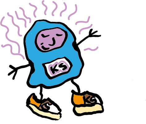
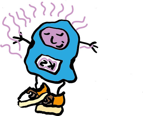
The second draft was an improvement as I managed to remove the border around the introduction. Adding the little cartoon man which is dancing to the music makes the video much more fun and adds another layer to the video. It was also fun animating him moving around the screen as I've never done it before, this also taught me a lot about premier pro, but has made me want to learn more as there's a lot of opportunity to communicate a message within a video. Within the video it doesn't say what exactly is being promoted also where to find the product therefore I will need to make that clearer to the audience.
In this version there is a text at the end of the video specifying where to purchase the product. After getting feedback on the video, it did seem like the ending of the video didn't match the aesthetic of Kidsuper nor matched the start of the video. More could be added to this part of the video in order to make the ending more memorable than a black screen.
To make the video more entertaining and relevant to Kidsuper. I thought of creating a scene of Lavender meadows for the cartoon man to run off into the distance. Below are flowers I drew by hand and then put through image trace on illustrator as the Lavender. Using the same technique I then used an image of fields and put it through image trace and changed the colours. Also adding many bright colours to the scenery was important to match the bright coloured text which would pop up, communicating to the person watching what the product is and where to purchase it.
This is the final edit of the video, overall I'm very happy with the outcome of the video and believe it matches Kidsuper's aesthetic and values. The new ending to the video makes the video so much more lively and rounds it off in a fun way. Im also happy with the length of the video as I believe it's more memorable when the video is quite 'punchy' and straight to the point as this is what was the goal at the start of the project.