Jac Stoddard's Blog
Myself Poster
These are some of my favourite artists and designers; Henri Matisse, George Condo, Liam Hodges, Iwan Gwyn Parry, Jackson Pollock, Colm Dillane and Austin Augie.
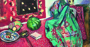
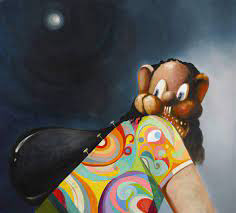
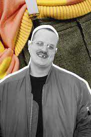
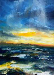
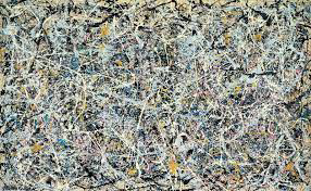
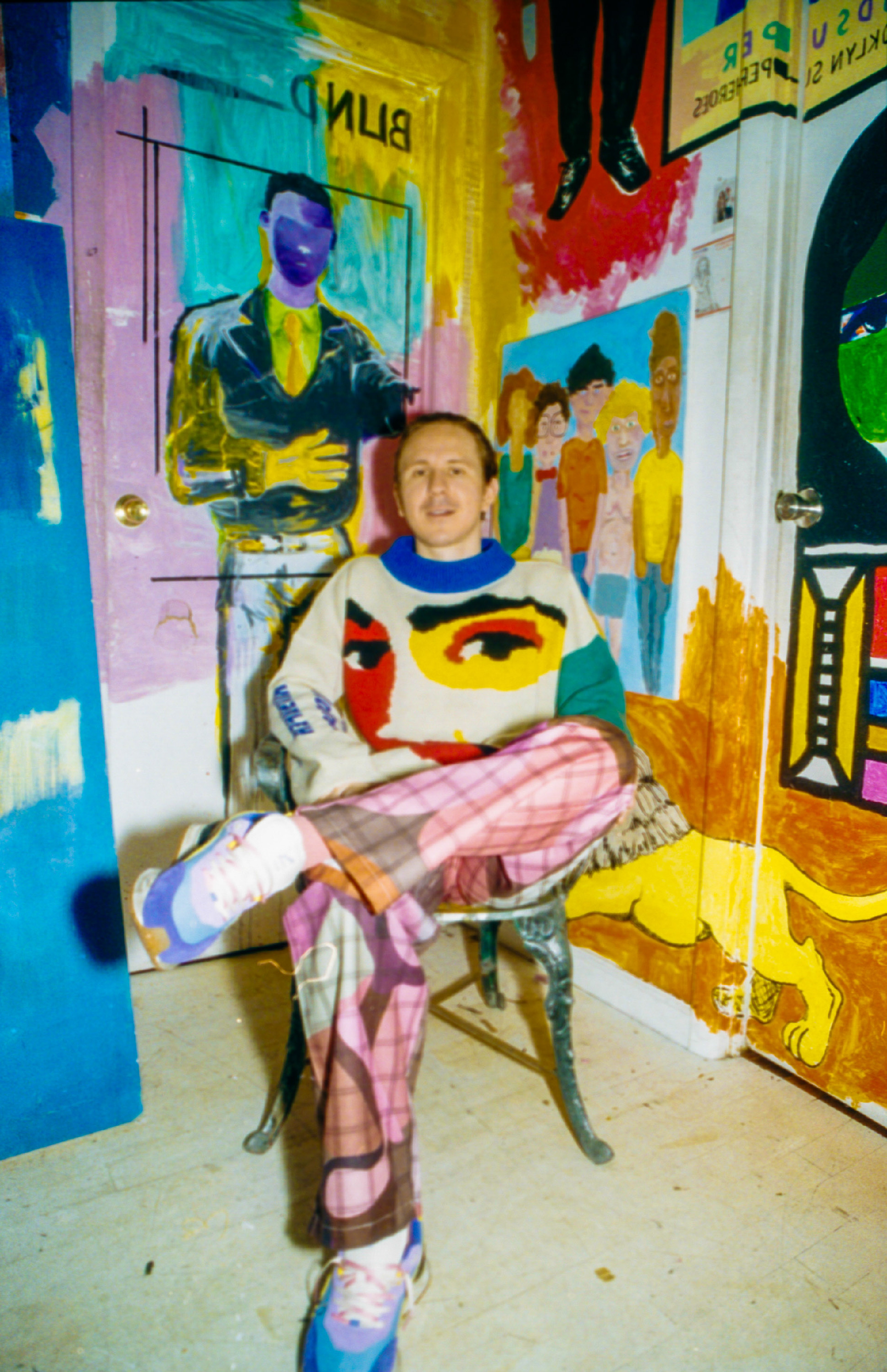
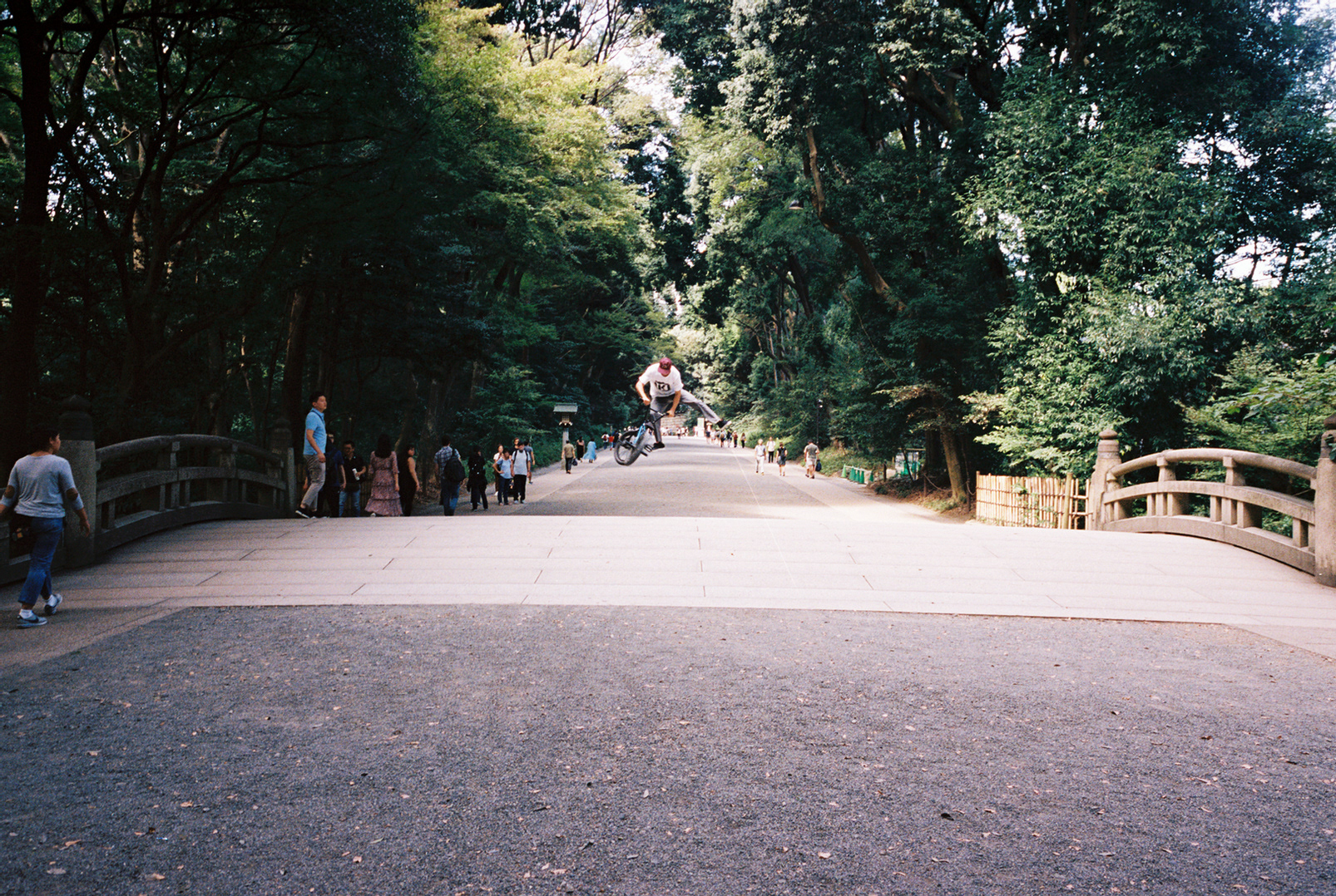
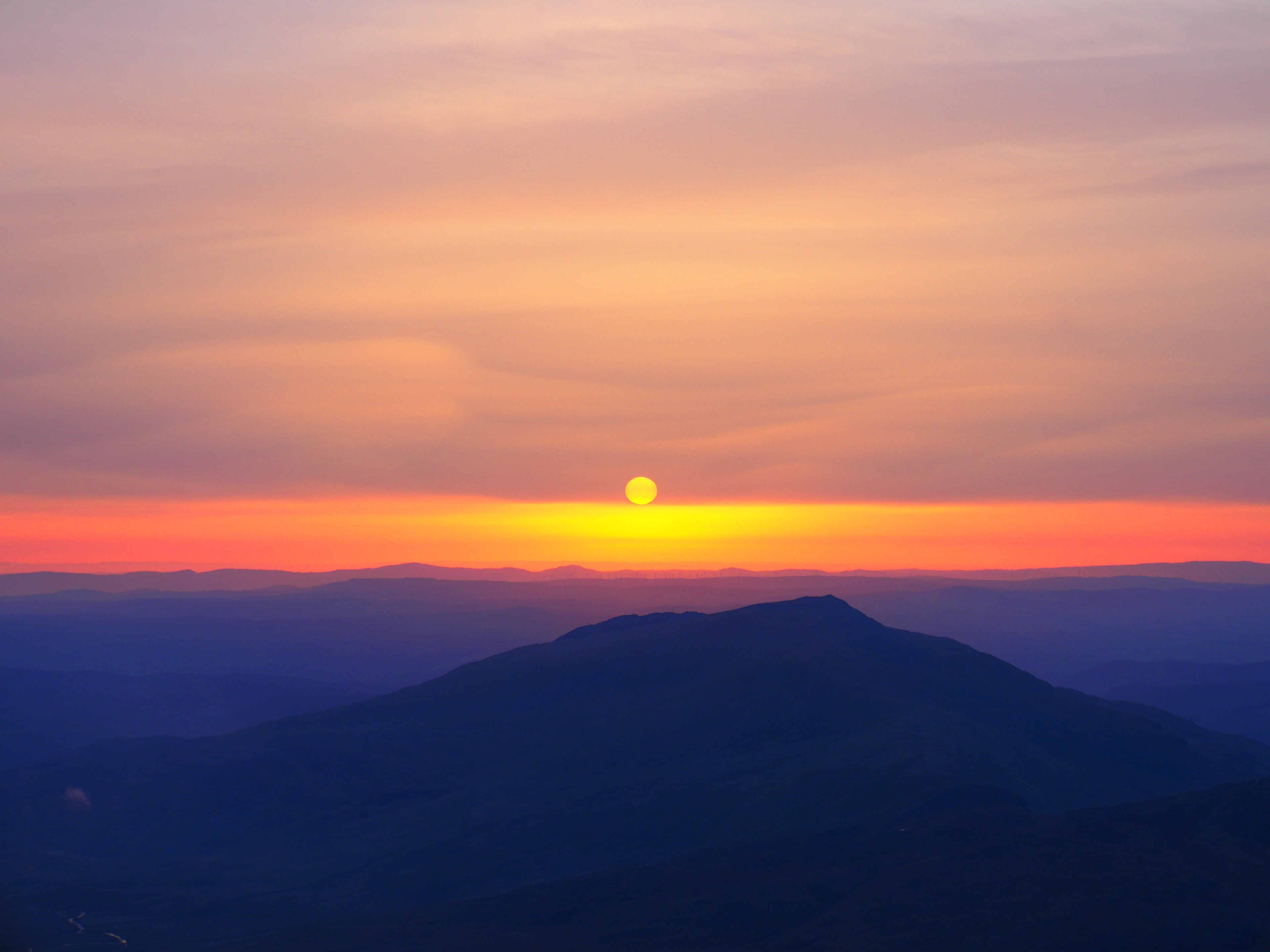
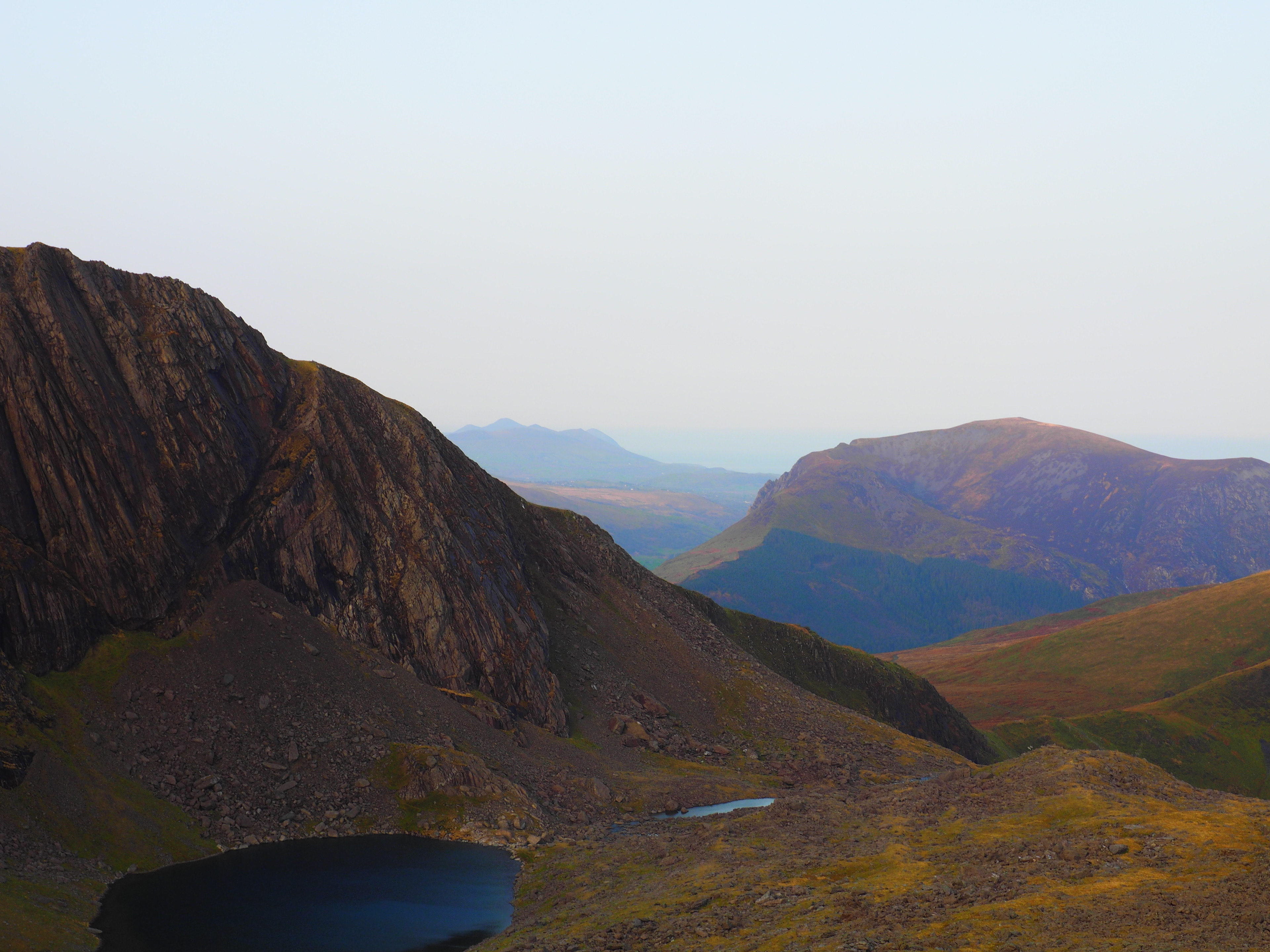
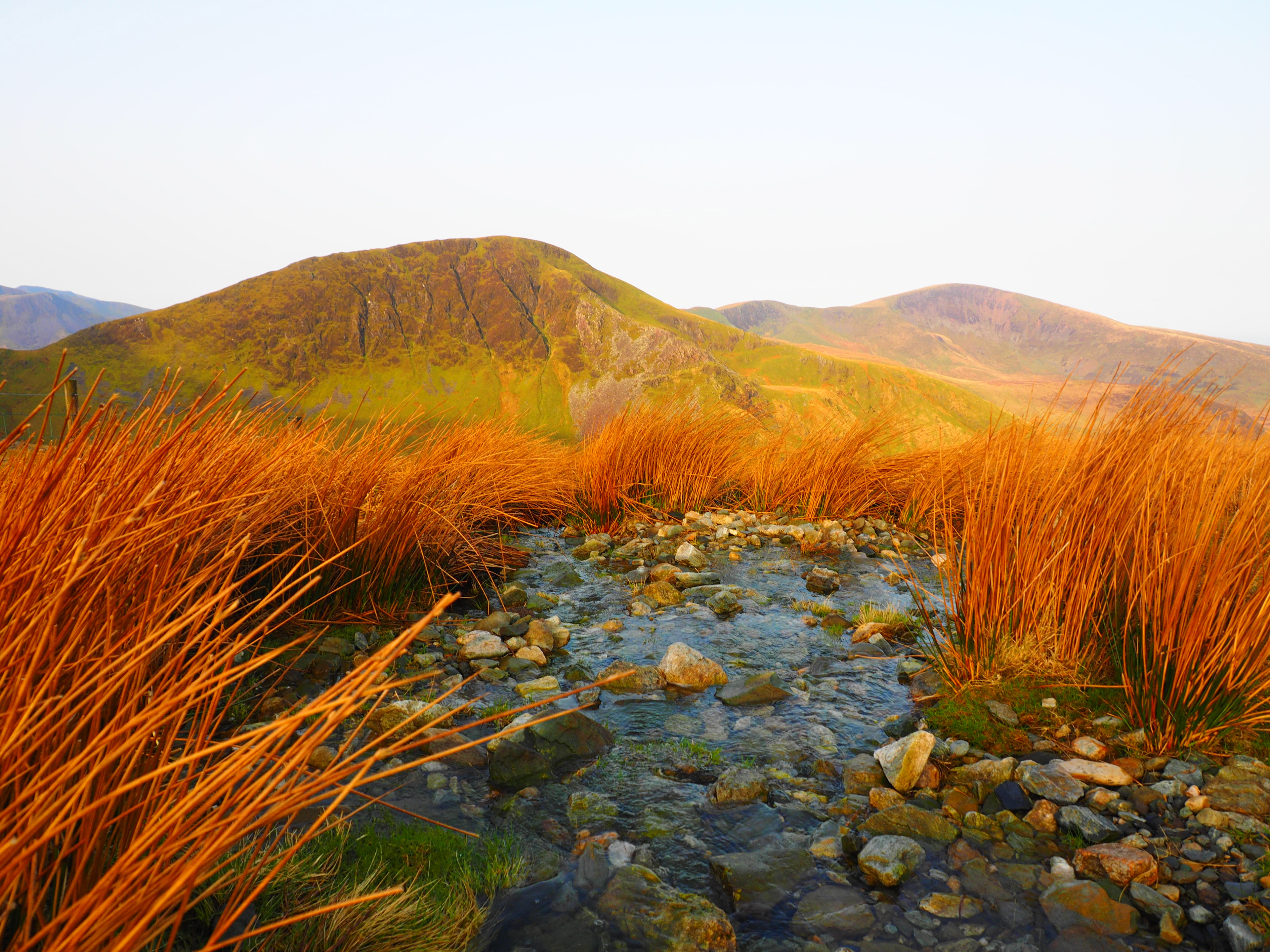
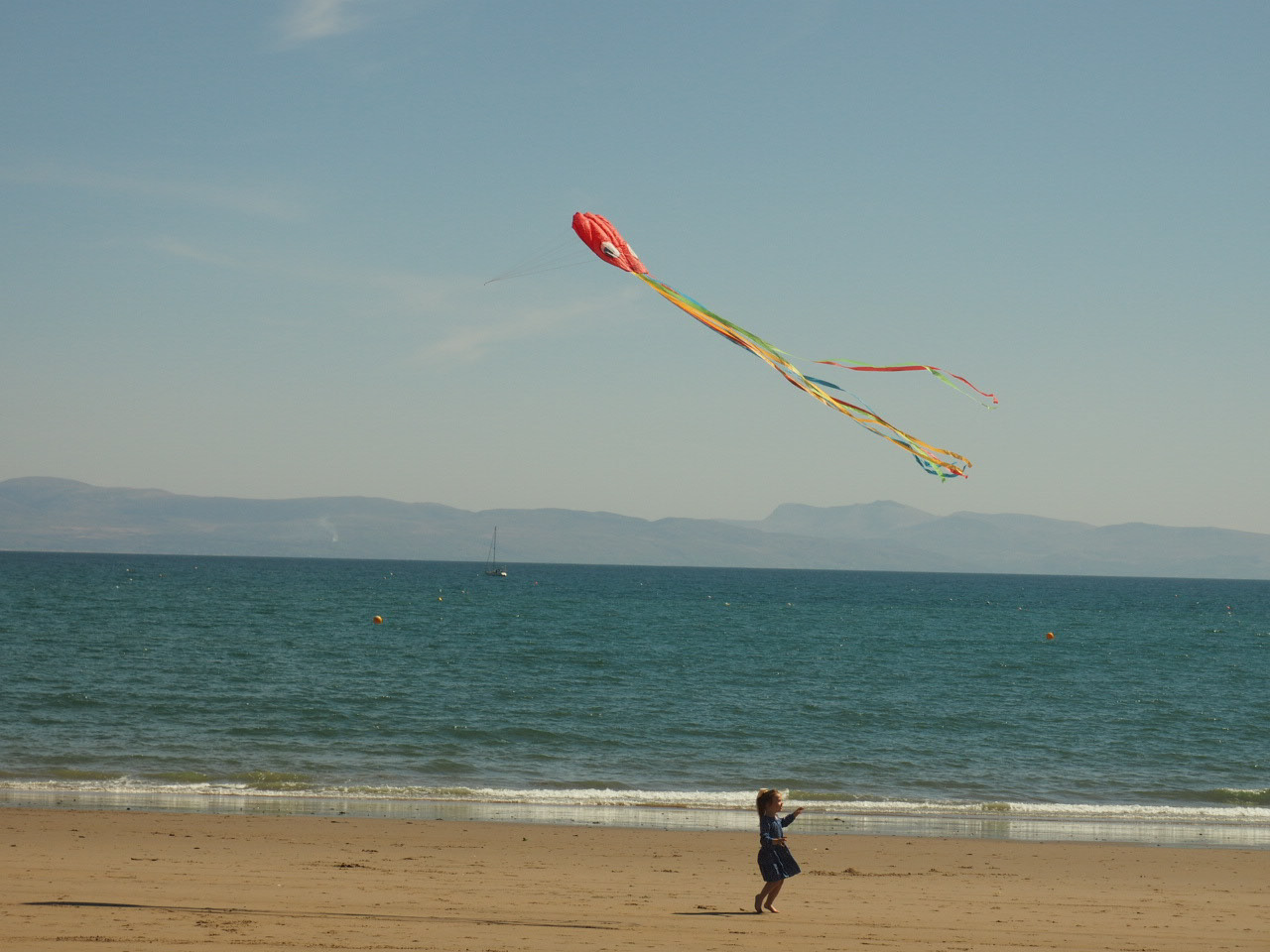
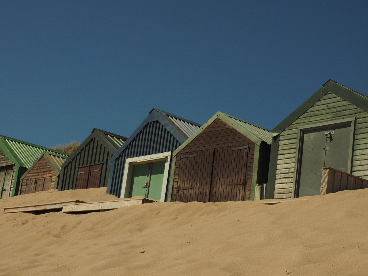
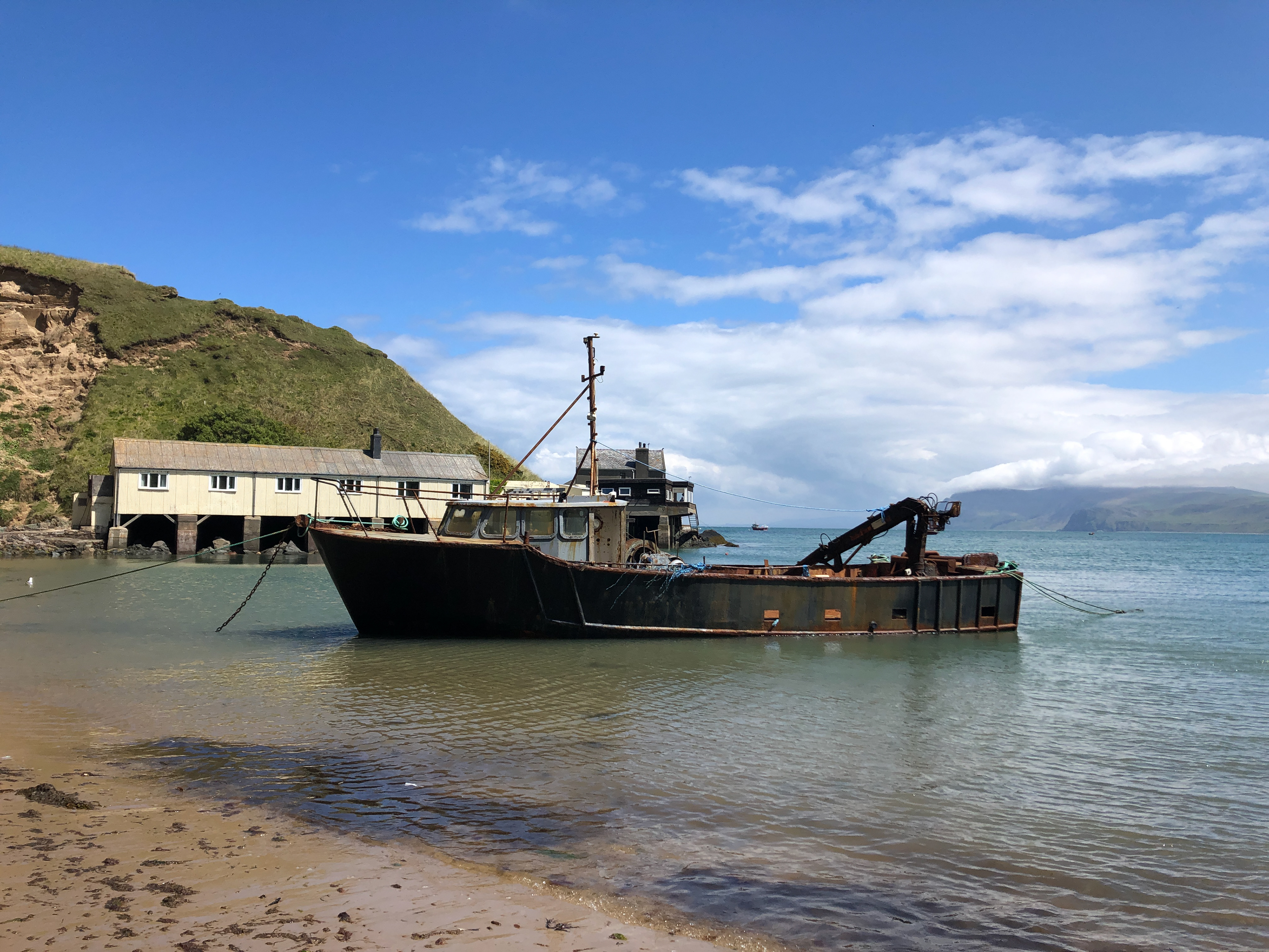
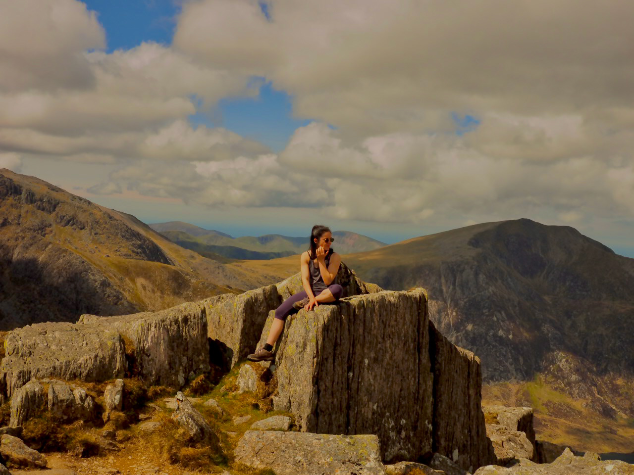
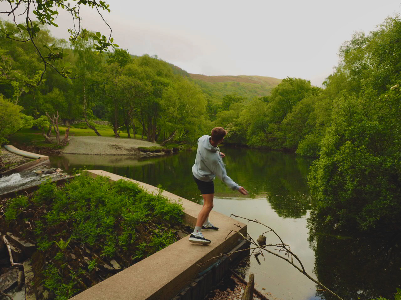
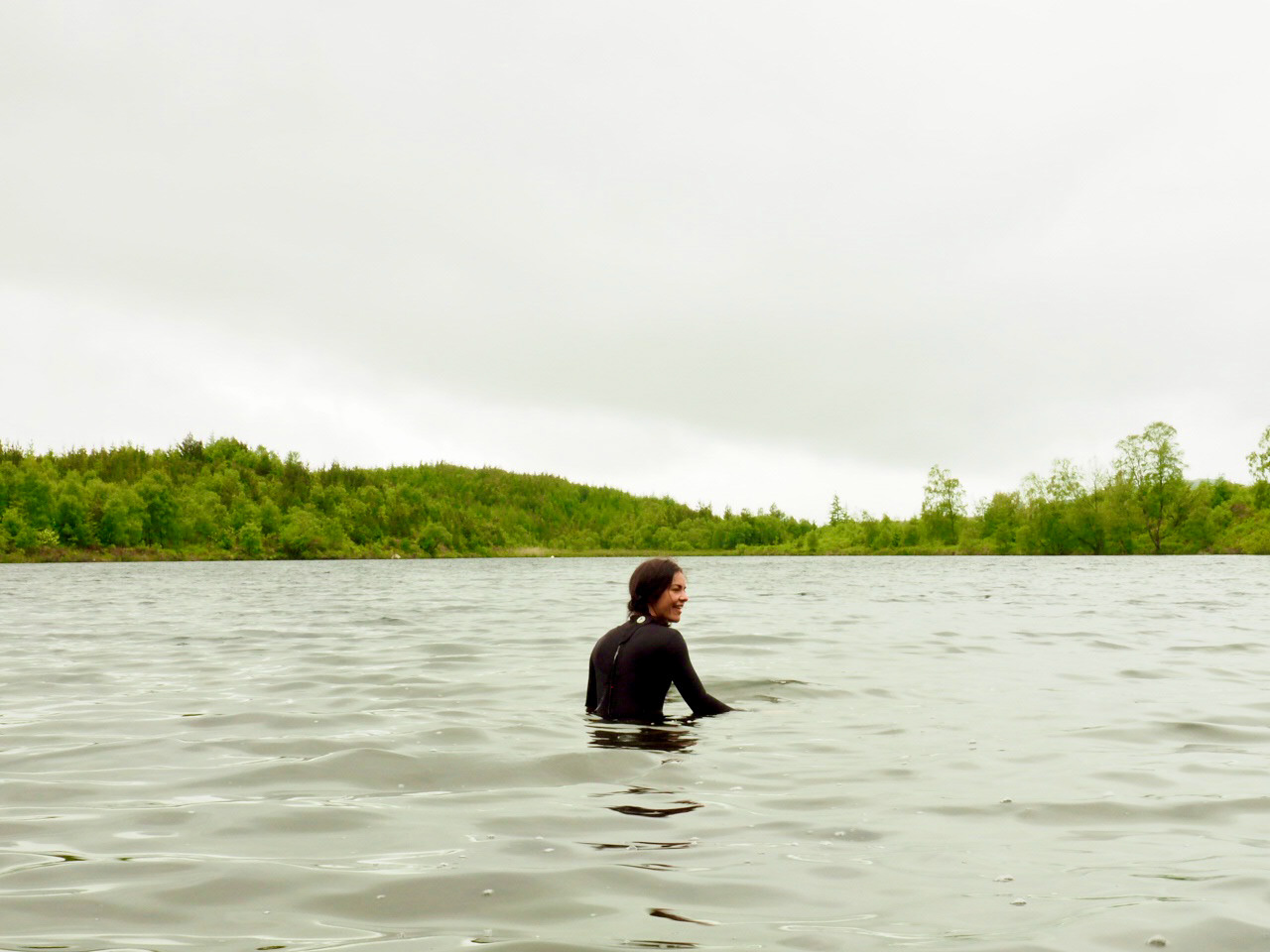
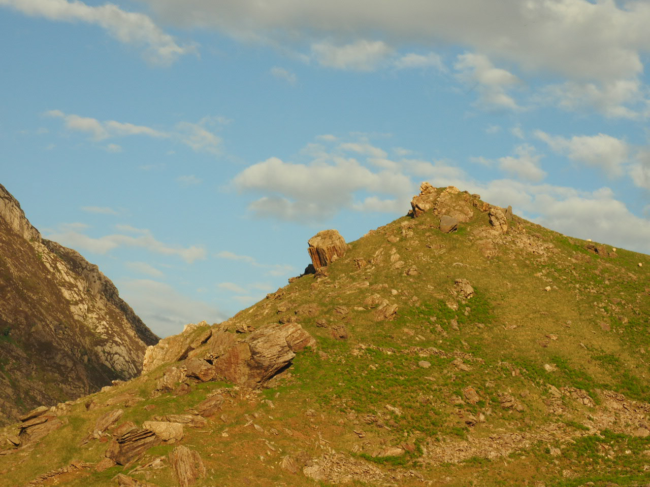
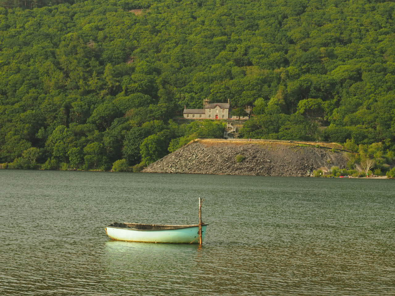
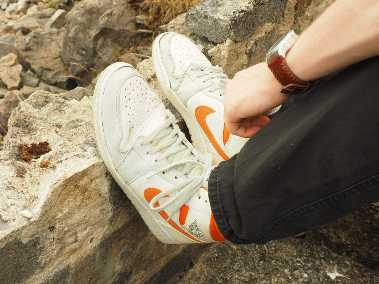
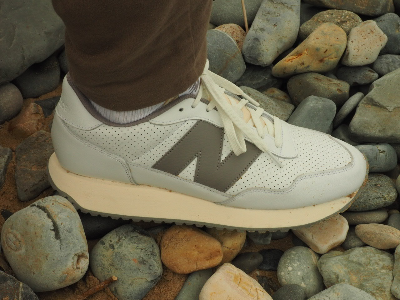
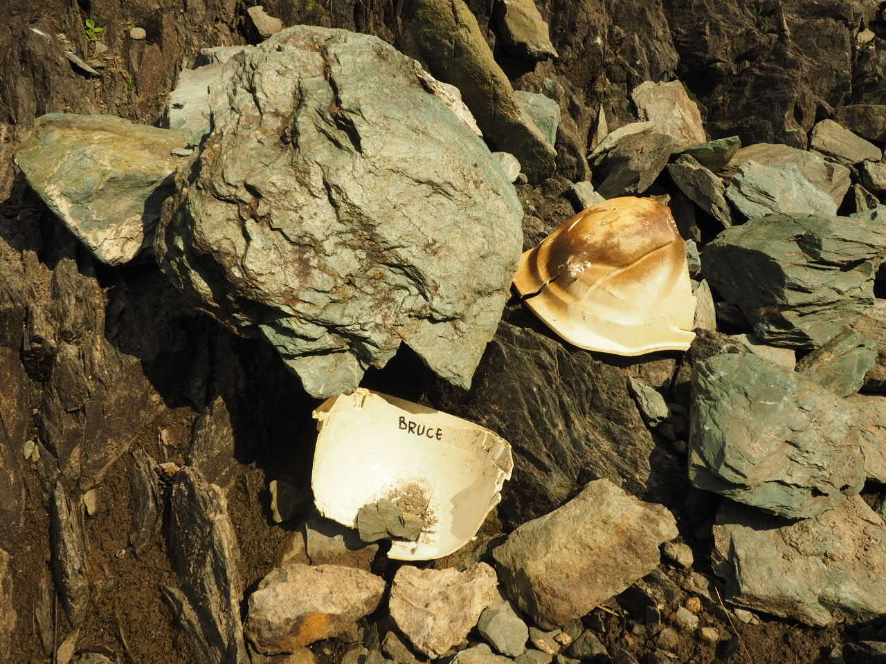
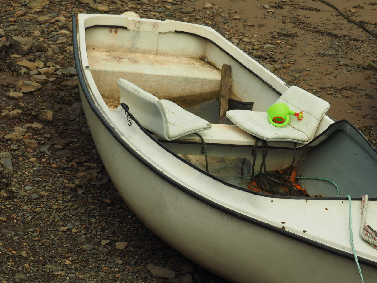
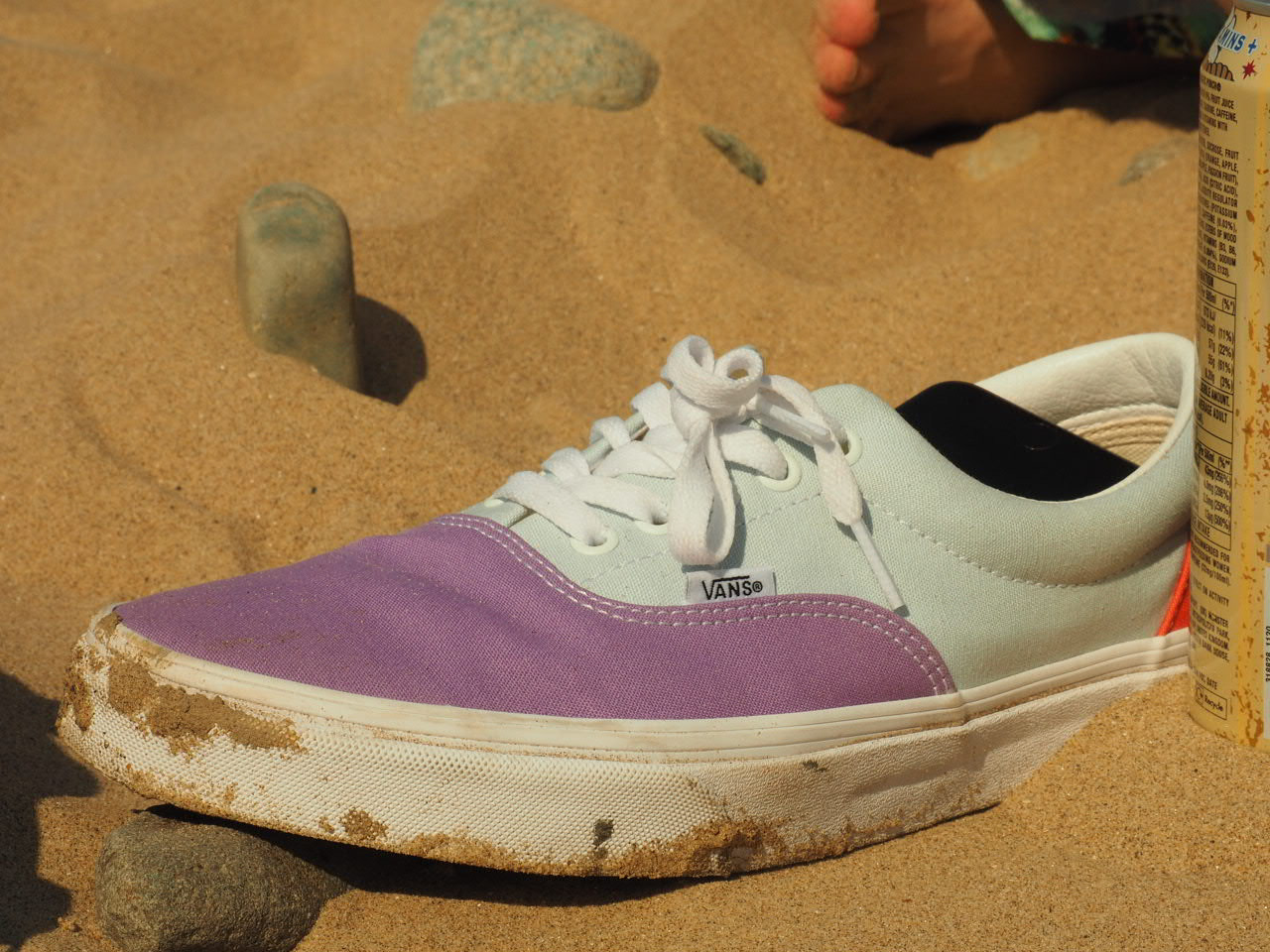
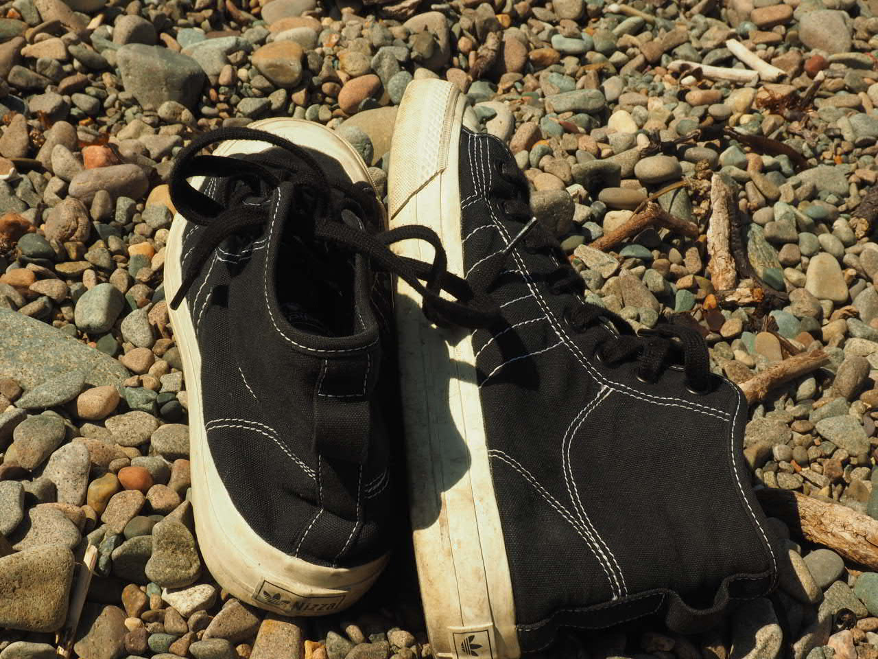
Surroundings which inspire me.
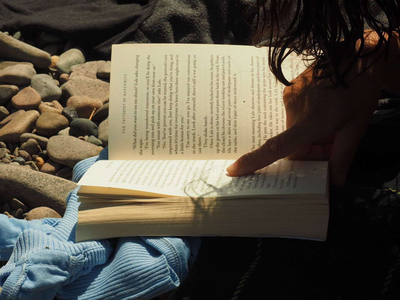
Myself Poster
What makes me?
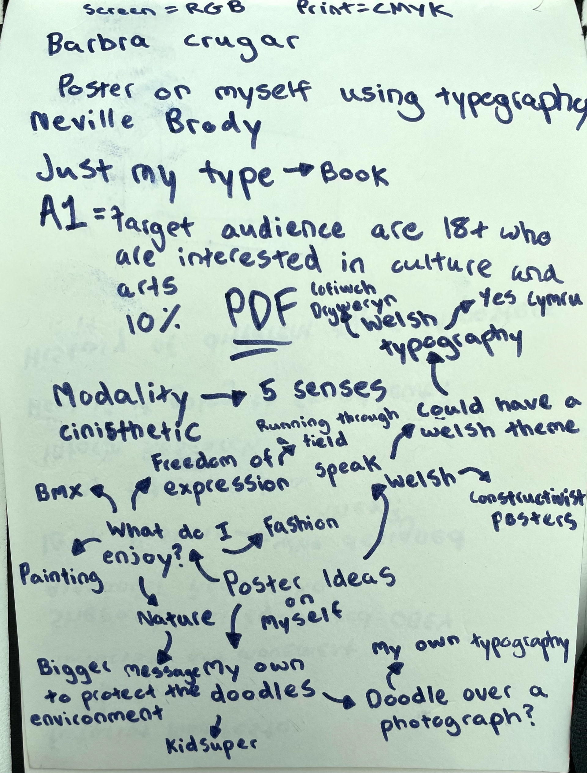
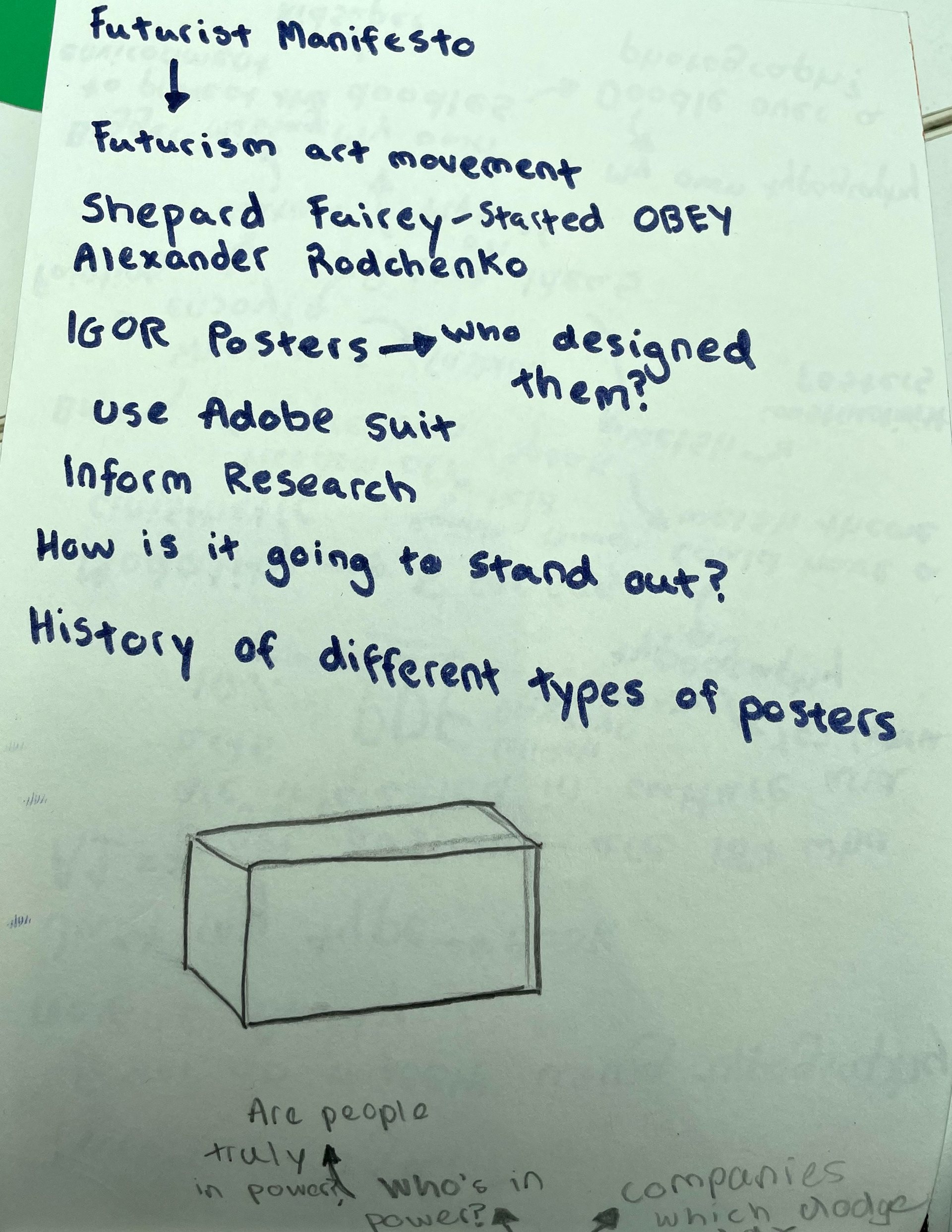
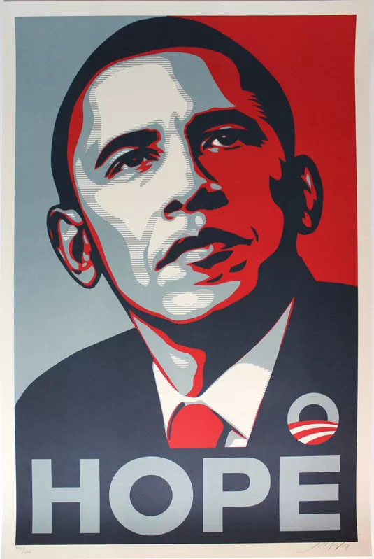
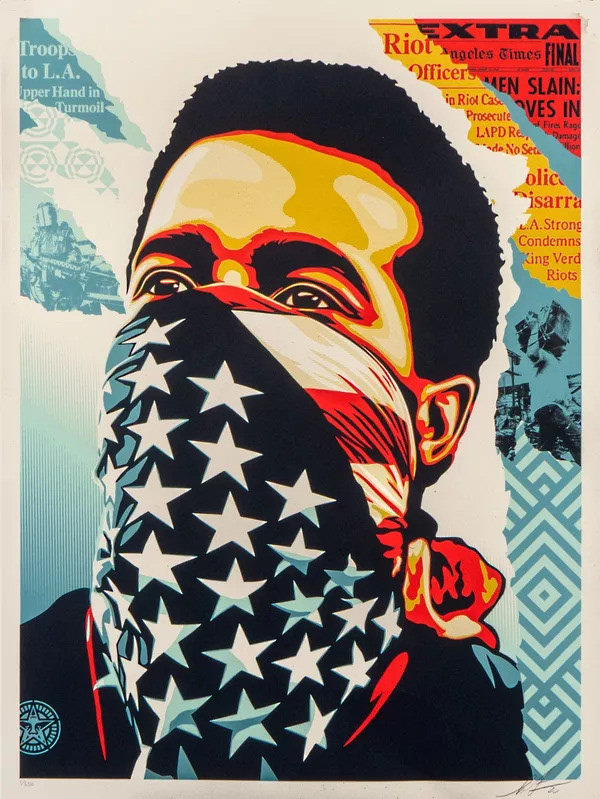
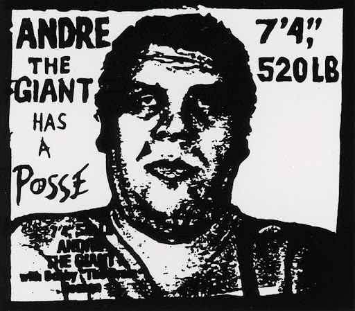
Shepard Fairey - Street Artist, Designer and Illustrator. Started OBEY clothing. I discovered Fairey when researching 'Yes Cymru' posters. Which reminded me of constructivist posters. These interested me as they portray a clear message and capture people's attention well through the use of bold colours.
Typography book from a charity shop. It captured my attention from it's use of red bold lettering, also the use of old zips and can tops was very interesting to myself.
Below are spreads from Heckler Magazine which is a; snow, skate and sound magazine. Their use of typography has inspired me a lot as I believe that it coincides with the images, which have a lot of quick movement, the typeface also looks like it's been written out in a rush.
Here is one of my initial ideas for type. I wanted to reference my ideas on taking a slower pace towards life and to enjoy the simpler things from day-to-day. In my opinion many people nowadays are in a rush to get to a job, or are thinking about what they need to do next, instead of being present. Also there is the welsh translation between both words.
As my CAD skills are fairly limited and I am interested in developing these skills, I wanted to experiment with Adobe Illustrator. I first had to figure out how to remove the white paper background from the writing. This was my first attempt, it was nearly the result I wanted but didn't quite achieve the fullness of the writing for more of an impact.
After some time fiddling in the settings, I managed to achieve the fullness I wanted.
Here I was experimenting how different angles of the writing looks and how it could fit within an image.
An initial image I had was cars driving at night with a slow shutter speed, to display the movement of rushing around. I started by placing one image over the other and experimenting with the opacity, the result of the lights crossing each other had added a quickness to the image. In my opinion it emulates the feeling of rushing around day-to-day and not having time for yourself.
Here I started to add the text into the image, I pasted the words twice over each other and lowered the opacity again, to try give a quickness to the text.
Adding layers of text added a energy to the overall impression of the image, which I liked as I feel very energetic sometimes with my thinking, in a sense of; I don't fully think things through, I just start with my initial thoughts.
I then decided to incorporate more imagery which reflects my interests and hobbies. This is an image I took at a skatepark in Bangor, North Wales. Where there is a growing skate/art scene, I wanted to experiment with this image in illustrator as it could be significant to the overall imagery.
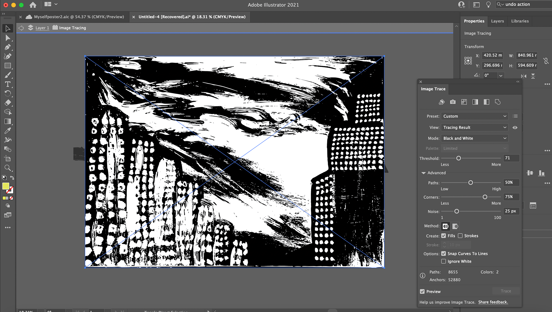
Again playing around with the 'image trace' tool I discovered an effect which drew my attention as it looked like someone had used a stencil with paint spray. Very similar effect to some of Banksy's work I found it very impactful.
Adding the picture of the skater with a slight opacity and flipped upright in red added an extra layer to the poster in my eyes as it isn't obvious it is a skater.
I then experimented with adding the skater image to an image of the scenery of North Wales as these are two images which I can identify many of my memories within. The birds in the top left hand of the image I was very fond of as it adds an extra layer of my own personality to the image, but doesn't make it very obvious.
Experimenting with the 'image trace' tool to outline the images key components in black. I thought of making the whole image black and white as it gives me more options to highlight specific parts of the image in colour.
Changing the colour of the skater image to a turquoise in order to bring attention to that area of the image. Also turquoise is one of my favourite colours therefore it is revealing another fact about myself to the audience.
Trying a different image in the background with some colours cancelled out, again through 'image trace'. I also added the 'Slow Down' wording across the image as if someone has written with a thick pen. But for some reason the image didn't co-ordinate well in my opinion.
Here I then tried creating my own typeface through using the pen tool. To me the jagged edges made the word more dramatic, making it stand out more.
Experimenting using black and white images as the background in order to make the typography stand out. This was inspired by the Heckler magazine spread. Even though they do use colour images, their use of black and white is very eye catching in my opinion.
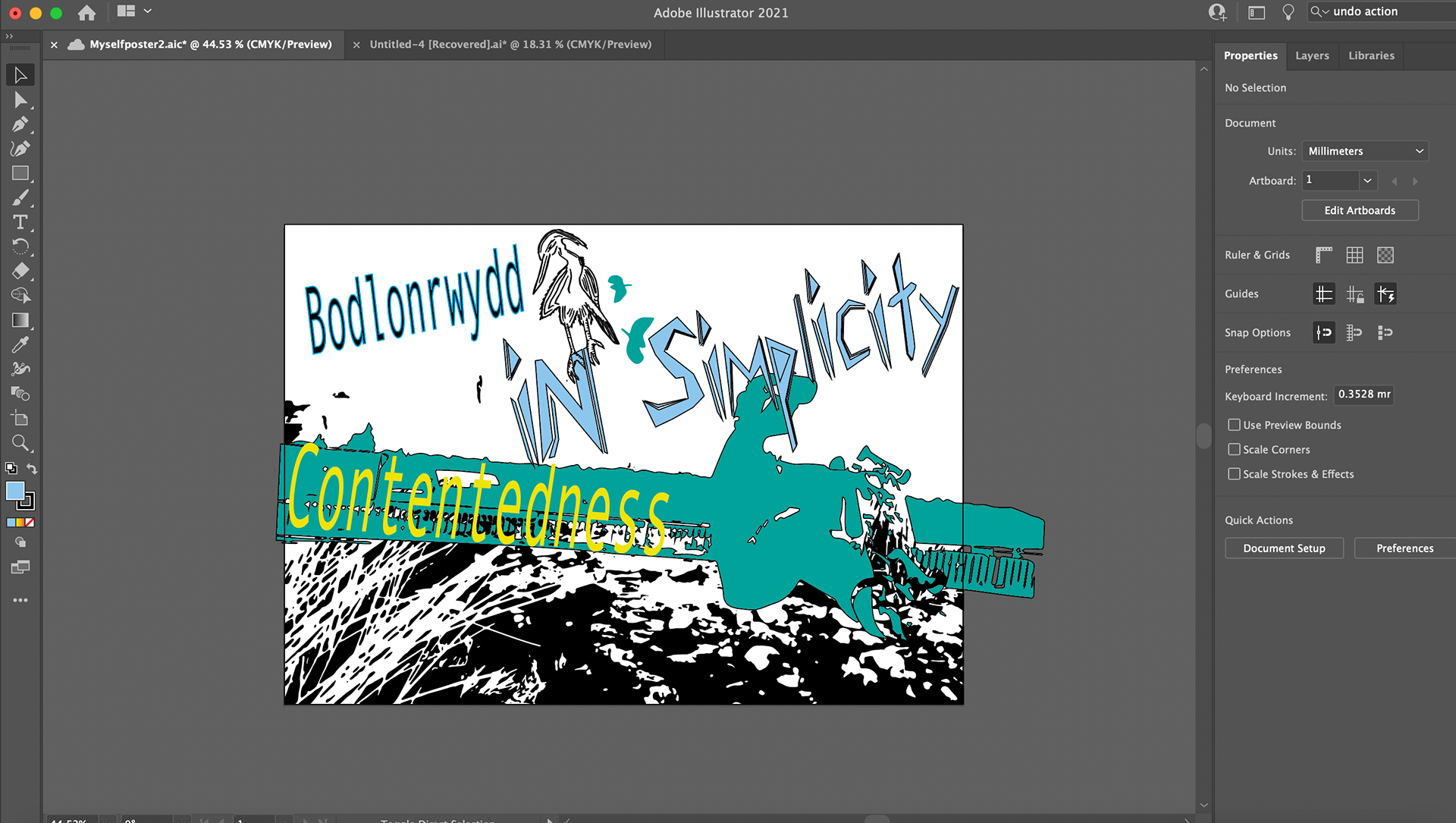
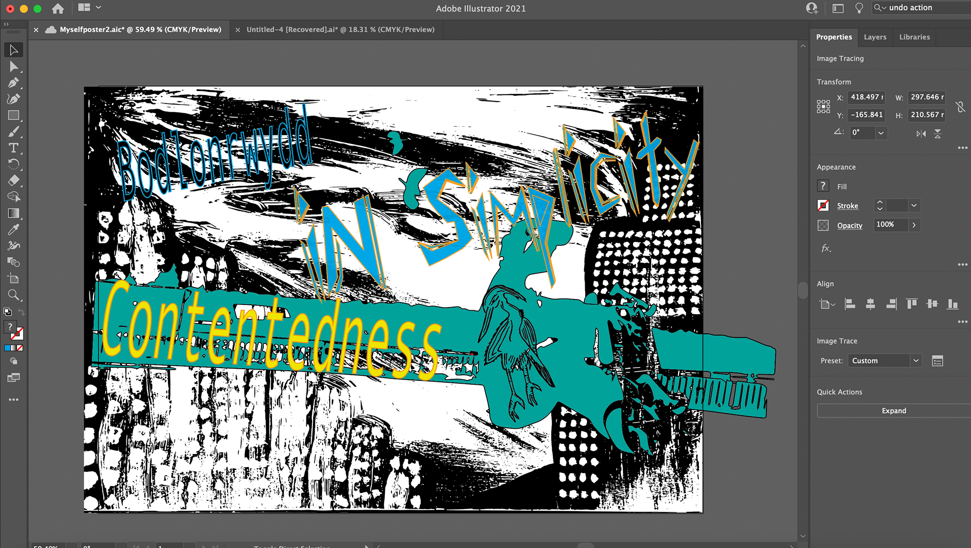
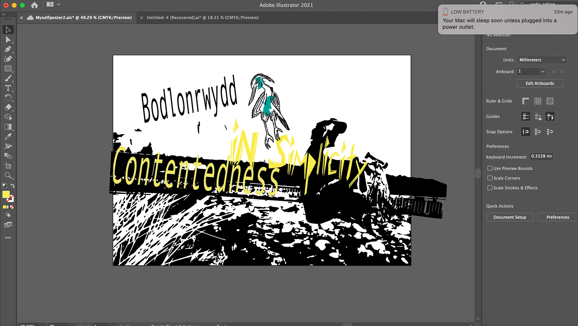
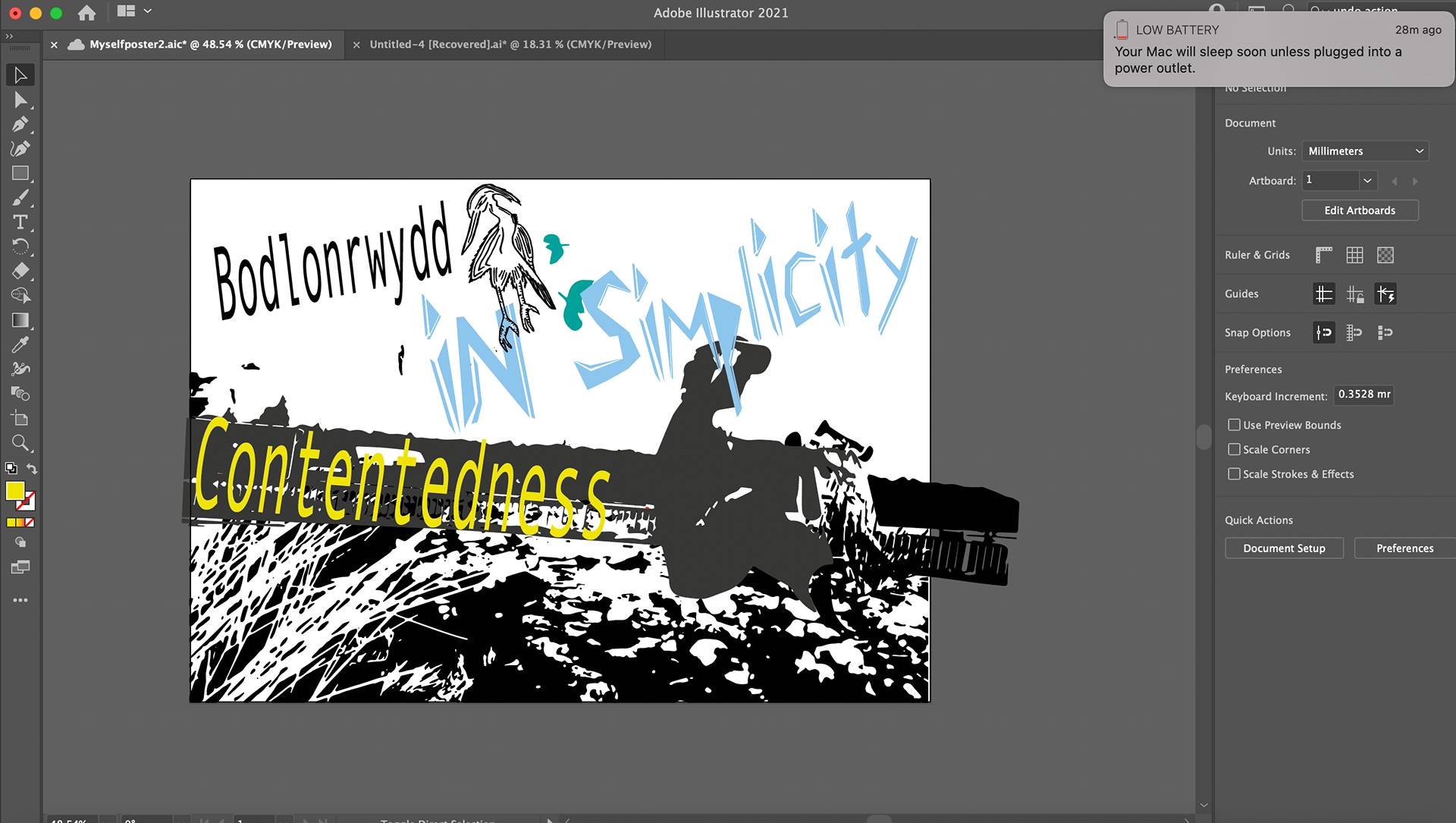
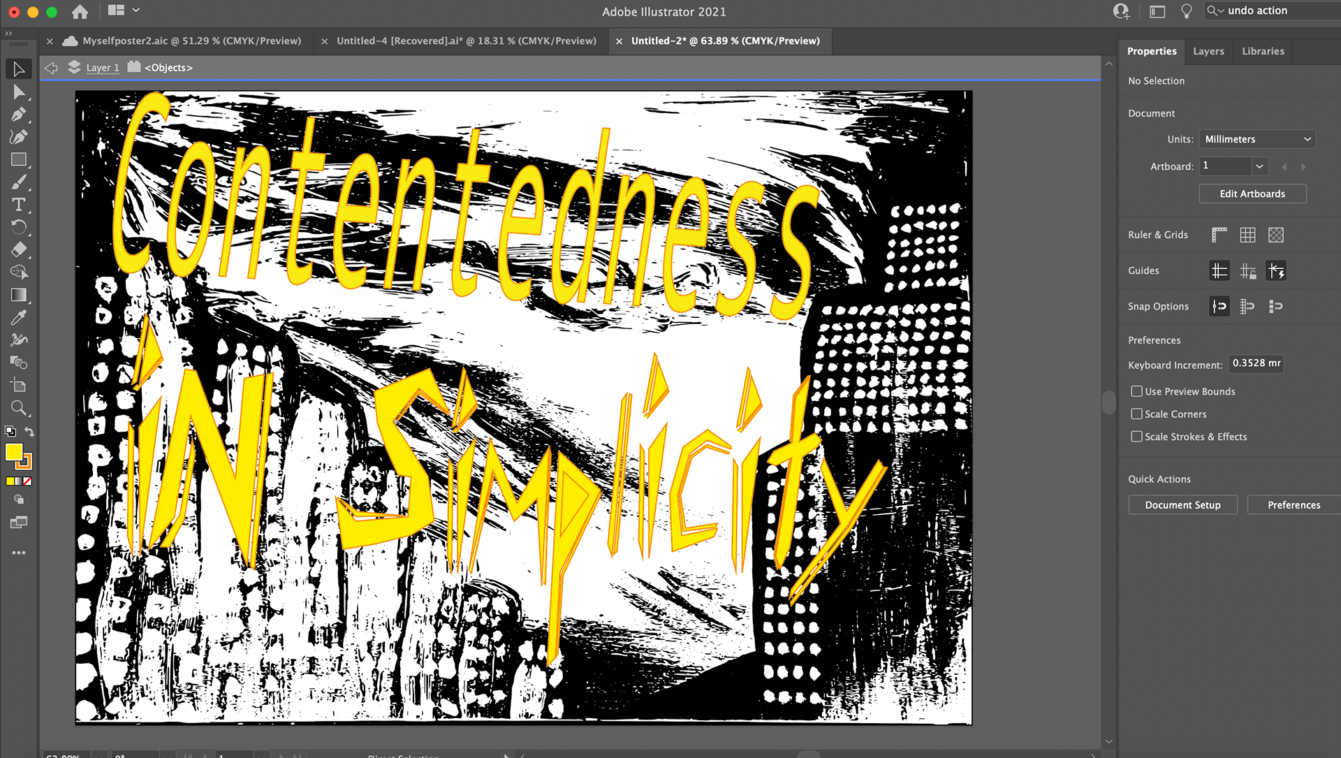
The smaller size font didn't have the impact to portray a message I wanted. Making the font size bigger did work with making more of an impact. But, also the font didn't visually feel right. The colours of the image I feel didn't really portray myself as I am more of a fan of blue, green, purple, pink colours. Therefore I decided to experiment with the original image of the skateboarder with different font and colours.
Here is the final poster.