Brandzine: "No Rules"
We were asked to develop a Digital Magazine for a fashion brand based on the theme "No Rules".
Initial Ideas
Initially when I heard "No Rules" I thought of the punk sub-culture and how they question rules which are set generally. This led on to the thinking of youth culture and which brands are pushing boundaries and breaking traditional ways of thinking.
As a group we decided on OffWhite as a brand, Virgil Abloh made a huge impact on the fashion industry in the last decade. Changing the perspective of consumers of what luxury fashion is by blurring the lines with streetwear. Being transparent in his practise, re-using and updating not only old materials but also ideas and injecting them with a new perspective. Therefore we felt OffWhite as a brand has broken many rules of traditional fashion.
We then decided to research more in depth into OffWhite, we delegated sections of the brand between us in order to gain an idea of how we present the zine in the aesthetic of OffWhite. I was given the task to research the target audience and how they could be engaged.
Kenzine
This Brandzine between Kenzo and Toilet Paper Magazine really inspired me for this project. Personally thinking of a Magazine in a purely visual format excited me. Before this discovery my perceptions of a Magazine, was a page with a picture, and writing. And that it had to include writing. Which to me personally isn't very appealing, as I am a visual person. It broke the rule which was in my head that a magazine must include writing. Therefore within the project I thought the focus should be on visuals as it breaks the stereotypical magazine having columns of writing. Also, especially now, people generally have shorter attention spans due to social media etc. Therefore visual language is far more effective.
Dapper Dan
Dapper Dan was a very important part of blurring the lines of streetwear and luxury. In 1982, he opened his store "Dapper Dan's Boutique" on; 125th Street, Harlem. Which stayed open 24 hours a day, seven days a week, in order to cater for his clientele ranging from; professional boxers and rappers. He sold fur at first, but in a party one day realised the way people got distracted as soon as they saw a Louis Vuitton handbag.
At this time period luxury ready to wear wasn't as popular with brands. For instance Louis Vuitton hadn't even released ready to wear till 1998. The biggest names in the rise of hip-hop wore his garments, such as: LL Cool J , Salt -N- Pepa and Big Daddy Kane. Unfortunately in 1992 the Boutique was shut-down after a trademark infringement case from Fendi. But he made his operations more private, a few years later, 1999, he started being Floyd Mayweather's stylist.
He is now recognised as a huge influence in fashion. Mentioned in "rap lyrics by Jay-Z, Pusha T, Lil Wayne and Tyler, the Creator among others." Ironically after being shut down by a designer brand, in 2018 Gucci offered to collaborate with Dapper Dan designing a capsule collection. But also in tribute to the original boutique, they sponsored a appointment only atelier in Harlem.
Watching Virgil lecture in Harvard was very insightful into the way he thinks and implements into his practise. During the lecture he emphasises learning context/history of art and design is important as it allows us to explain current thought processes. Not forgetting that the best artists/designers that have lived were even inspired by someone. He says that once your brain is "re-programmed" and understands the thought process behind a piece of art/design, you can then place yourself within that process to come out with your own outcome.
Glasgow Airport 1964
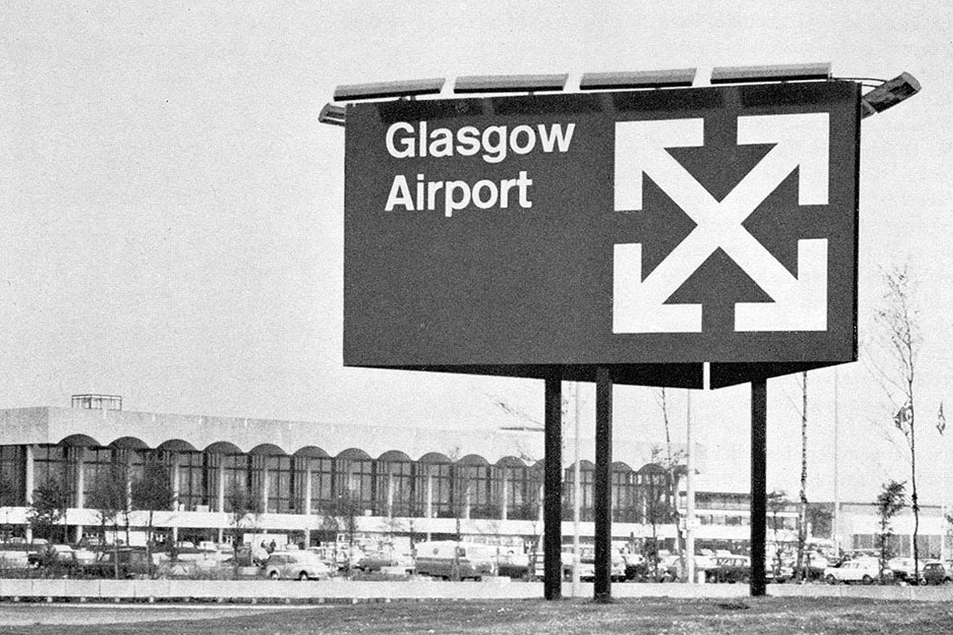
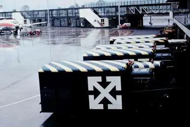
When researching into how OffWhite target their customers I discovered a concept called "Tourist Vs Purist", this is the thought process of segmenting consumers which Virgil Abloh used.
In his words “It’s my organizing principle for my point of view when I make things. A tourist is someone who’s eager to learn, who wants to see the Eiffel Tower when they come to Paris. The purist is the person who knows everything about everything.”
I found this concept very interesting and gave me a much better insight into how the project could go forward by targeting both "Tourist" and "Purist".
https://om.co/2022/01/03/tourists-vs-purists/
When discovering that "Over 90% of the 150 million people on Instagram are under the age of 35", it was clear this is why OffWhite has a very strong social media presence. It's the most direct way of communicating with consumers, creating a closer relationship with customers. Portraying a culture through music, art and design. It envelops the customer in the world of OffWhite, creating a desire to be a part of the culture.
https://www.businessinsider.com/instagram-demographics-2013-12?r=US&IR=T
This new experimental platform started by Virgil Abloh allows consumers to interact and change channels just like a tv. It features DJ performances to artistic videos, in Virgil's words "I want to connect and generate a global network, and bring together creativity while catalysing a range of emotions.” It allows the consumer to be immersed in the culture around OffWhite, it makes them feel a-part of a community giving them a sense of worth.
After seeing this video based around artist Andre Saraiva who is a Paris based graffiti artist on "Imaginary TV" helped inspire me a lot for this project. The videography of the graffiti was very eye catching in my opinion and matches the theme of "No Rules" as graffiti is literally illegal. Also graffiti captures the spirit of youth in my opinion and encapsulates the idea of "rebellious youth" perfectly. Also this art form was heavily involved within the hip-hop culture of the 90's. This growth in hip-hop culture introduced to the masses the art of "sampling", which in my opinion influenced artists forever, in the sense of re-using art to create new art, with a new direction. This being the period where the likes of luxury and streetwear started blurring, thanks to the likes of people like Dapper Dan.
When researching into OffWhite, I discovered that the logo was extremely similar and arguably the same as Glasgow Airport from 1964. This was very interesting to myself after hearing Virgil speak on transparency in design, and not being scared of showing you've been inspired. To me it showed how powerful the OffWhite branding is, as it has given the Glasgow Airport logo a completely new meaning. Personally this is "Rule Breaking" as the thought of "copying" other people's work is being questioned.
First Shoot
The original idea for this shoot was when I found the Handbag on the side of the street and decided to write "FULL OF SHIT". The saying is meant to be a humorous way to describe the contents of the bag. In my first shoot it was in a park because I thought it's look quite contemporary hanging from a tree. But this led to a thought process of thinking about possible valuable items being thrown away on the street. Just like the way I originally found the handbag.
The shoot needed to be shot within a skip, which holds unusual items. The idea was to write on items in a skip and take a picture with the bag. Luckily I discovered one full of electrical items ranging from; Keyboards, Computers, Telephones, Fridges, the list in endless.
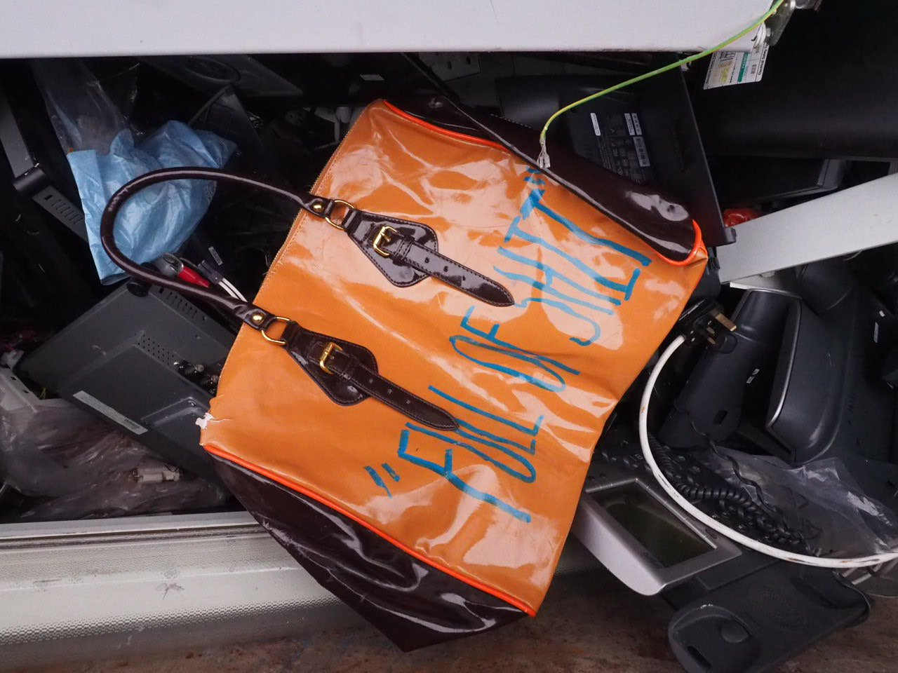
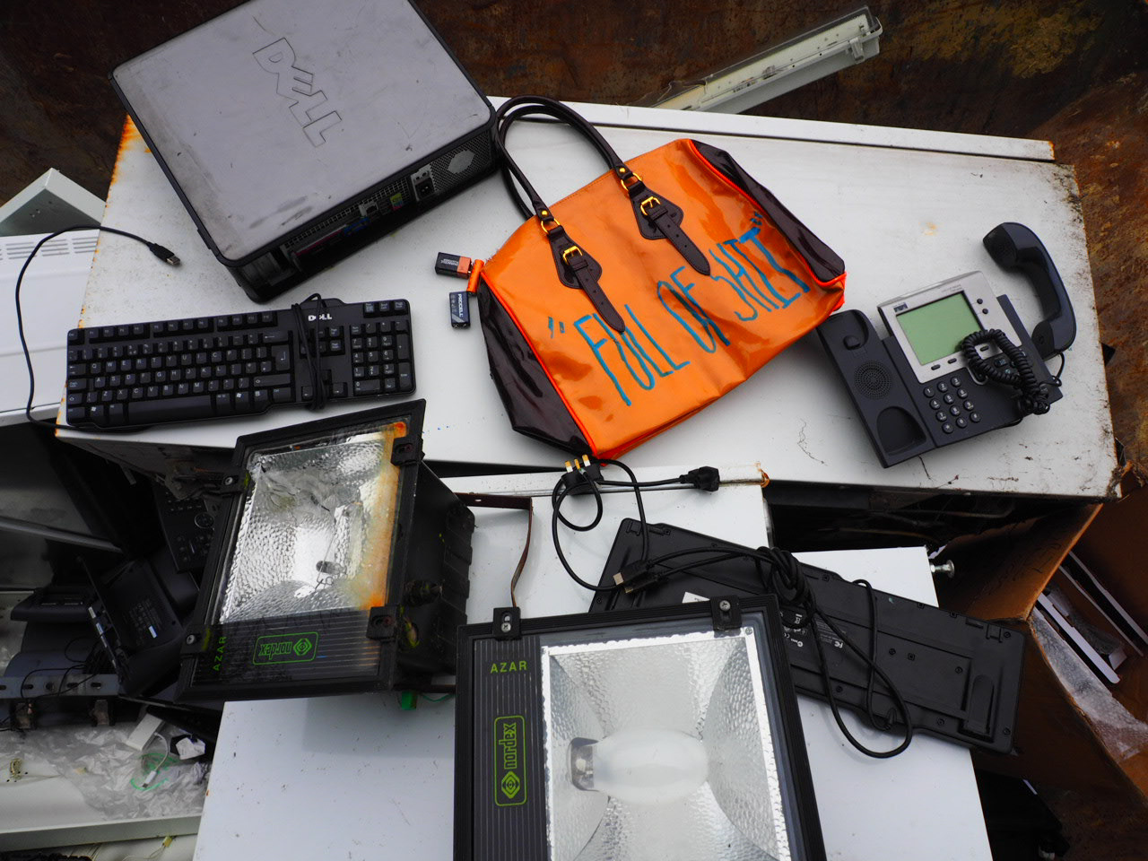
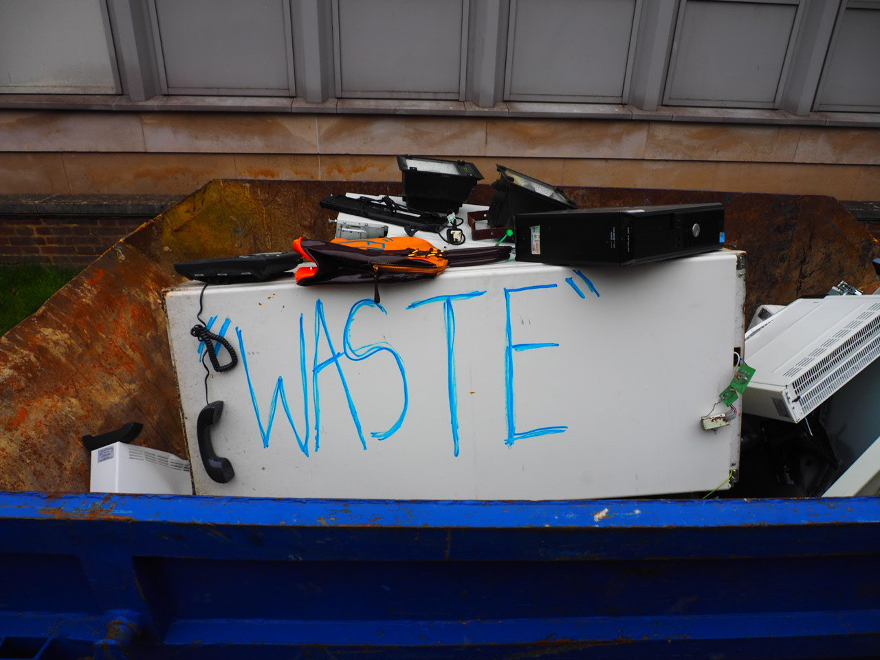
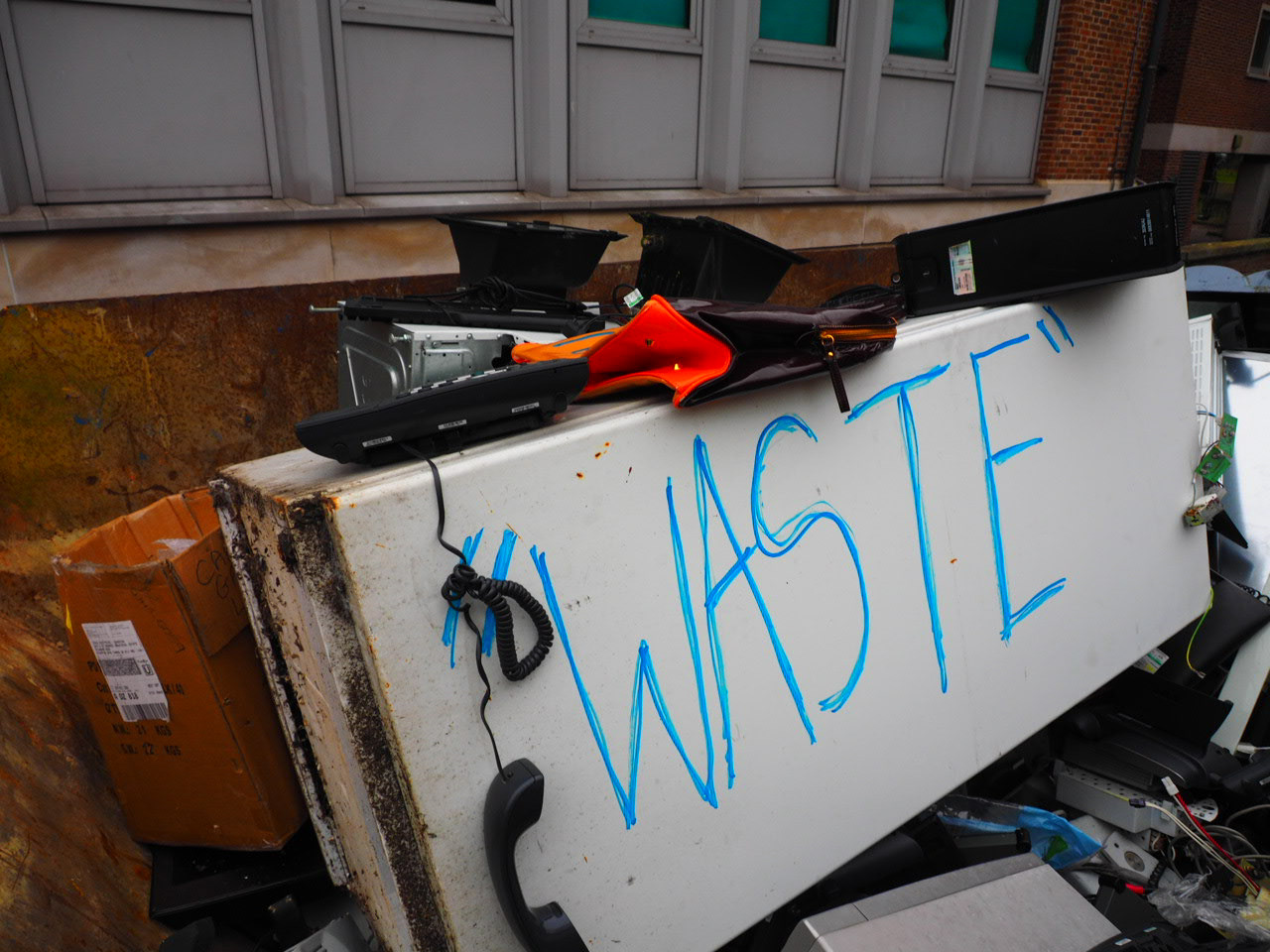
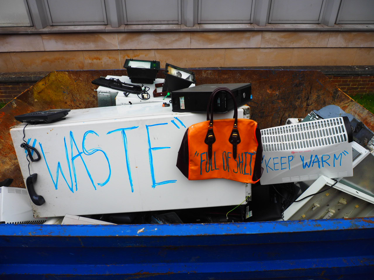
The items composition works well in black and white in my opinion, almost looking like a collage rather than a photograph. Also in my eyes it reflects Virgil's ideology of re-using designs to create a new idea, which I thought was a very important aspect of OffWhite.
Edited
Second Shoot
After finding out Off-White logo was inspired by Glasgow Airport's Logo from 1964, I decided to research into who designed the original logo. Only to find it was Kinnear, Calvert & Associates, the UK design group who have designed Britain's modern road and motorway signage. So literally turning a design from the street, to street-wear, bordering into luxury. It amazed me how one logo broke through so many boundaries reaching across multiple industries.
The original idea for the shoot was to draw on a road sign as homage to Kinnear, Calvert & Associates. But couldn't find one in the right location. Instead I decided to draw my own interpretation on a road sign in the street against red graffiti. Videoing the process would could look visually interesting too.
The interpretation of a sign wasn't the best unfortunately, maybe if it was done with spray paint on a larger scale it would work. The man standing in a triangle is meant to be an ironic version of "men at work" signage, instead of at work, just standing there. But I wasn't too happy with the outcome as it just looks like a doodle in a book and not signage.
The outcome of the process being filmed was the best part of the shoot. The camera being still in one place with a wide shot worked well in my opinion with the cars and pedestrians going past. It looks un-staged in my opinion which works well and gives the feel someone's been caught on camera drawing on the wall. This also reminded me of watching a clip on OffWhite TV of the graffiti and thought this could be an aspect to focus on, as it quite literally is technically "criminal damage".
The sound in the video are random sound effects cut from random videos on my phone. This was inspired by 4' 33 " by John Cage. Which is music, which has no sound. Technically silence is the sound. This concept was very intriguing to myself as it's breaks your perception of what music could be. Therefore for the "music" of the video, I wanted it to be random. In my opinion the sound effects work well, especially the train announcement. It allows the viewer to relate to a setting they're familiar with.
Third Shoot
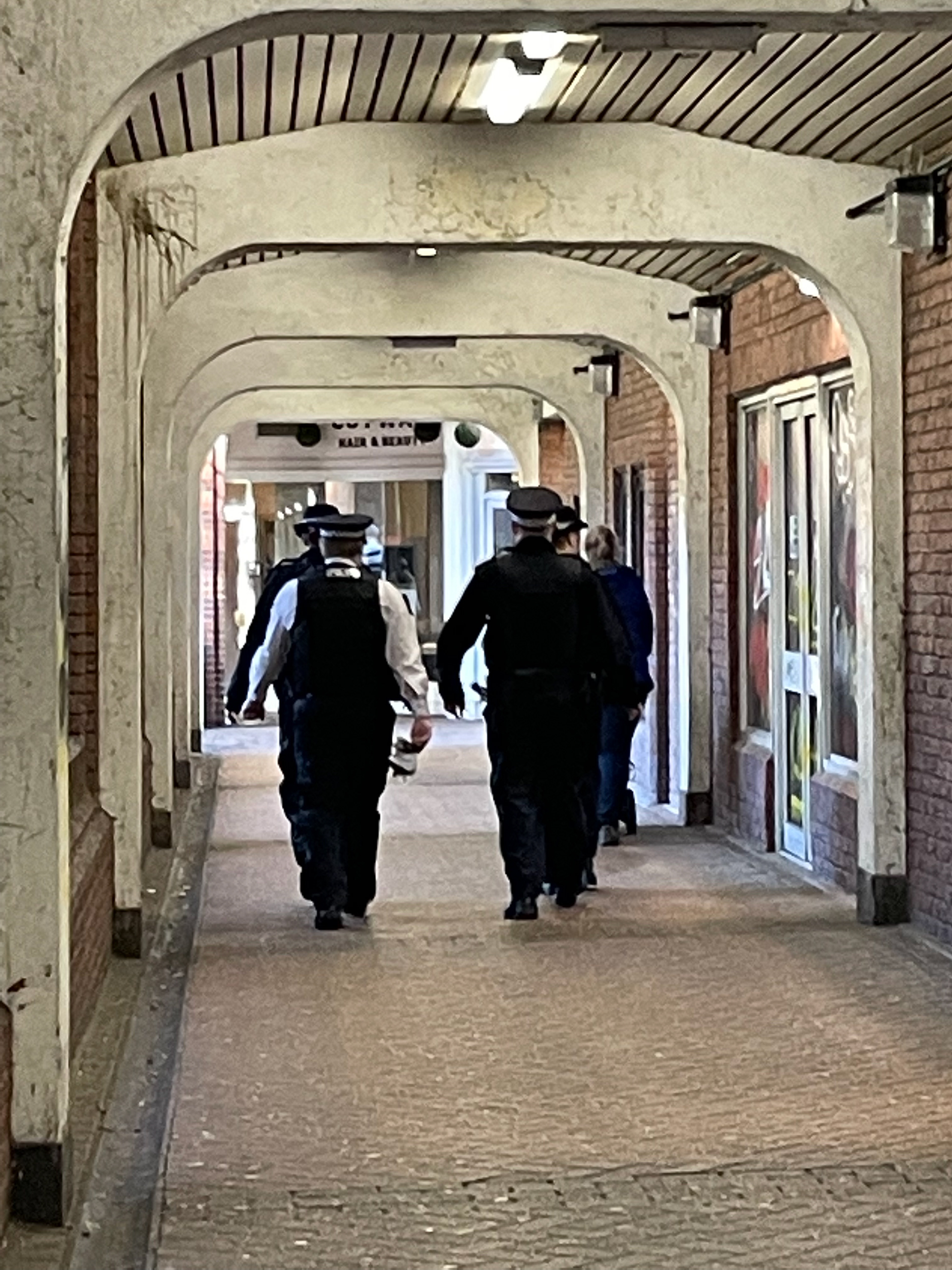
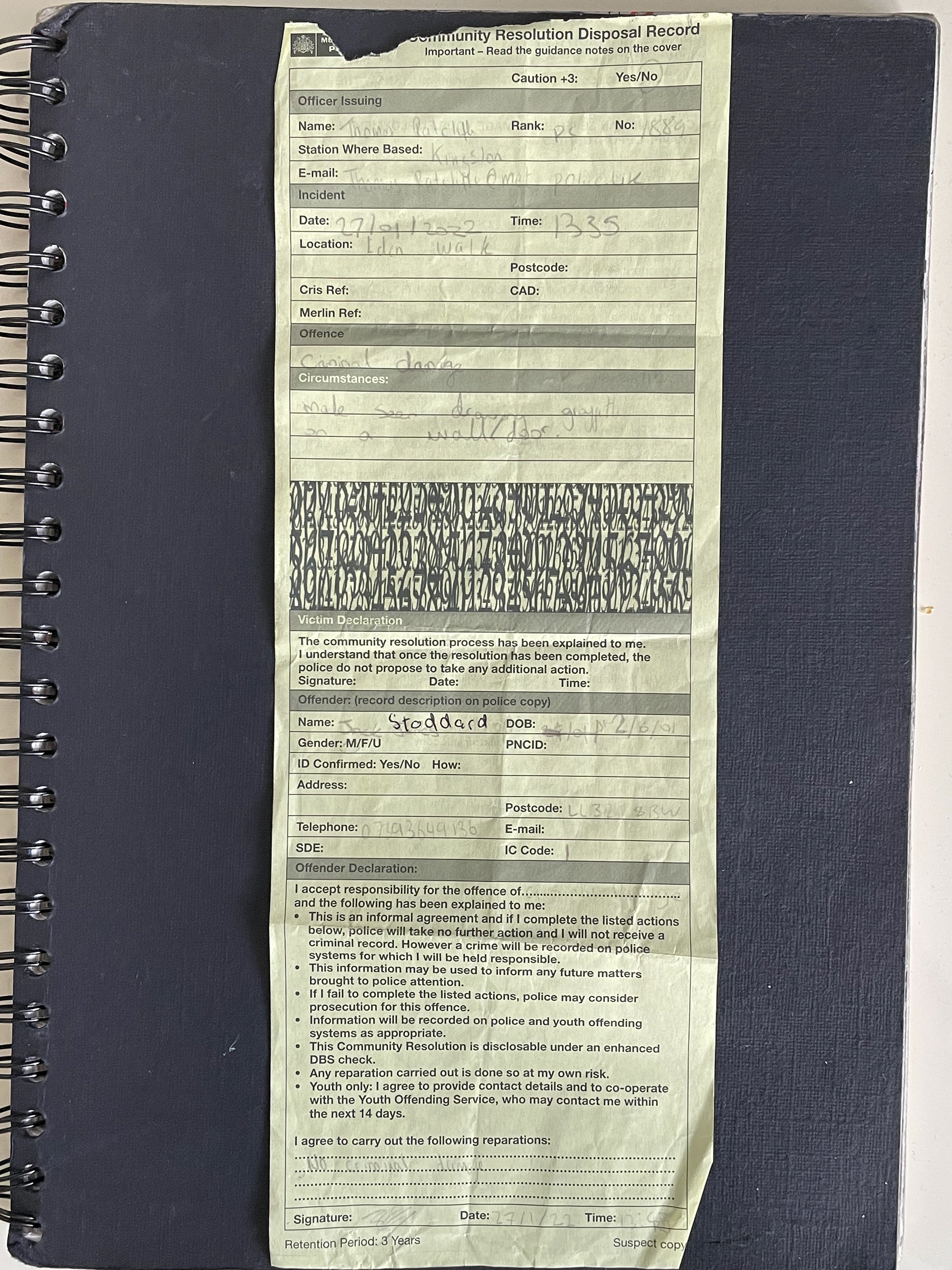
This shoot faced some problems unfortunate events. Half way through drawing on a black board police decided to stop me from doing so. They appreciated the work but needed me to wash it off immediately, and gave me a written warning. But in some ways this added to the shoot as it truly does reflect the theme of "no rules".
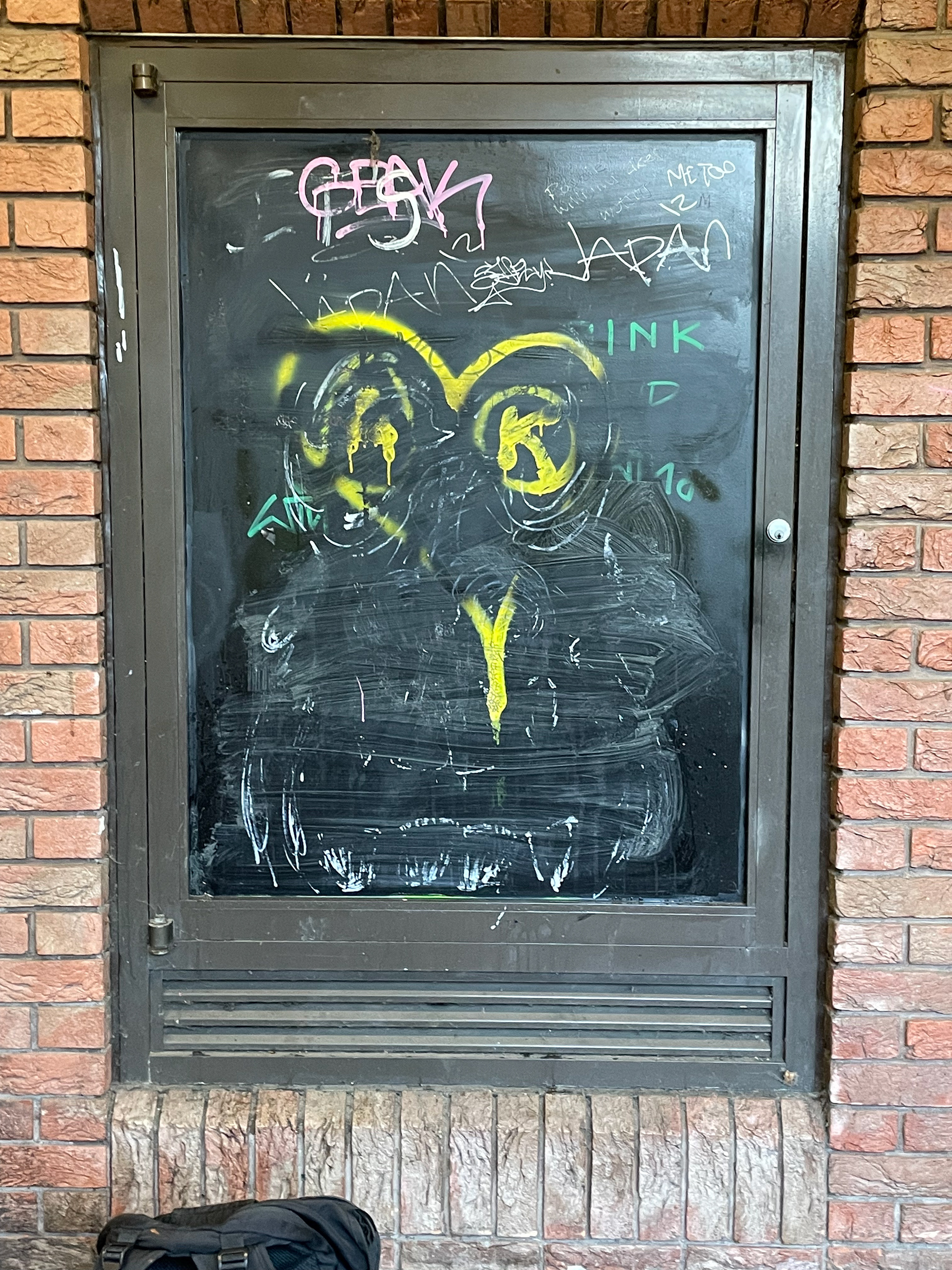
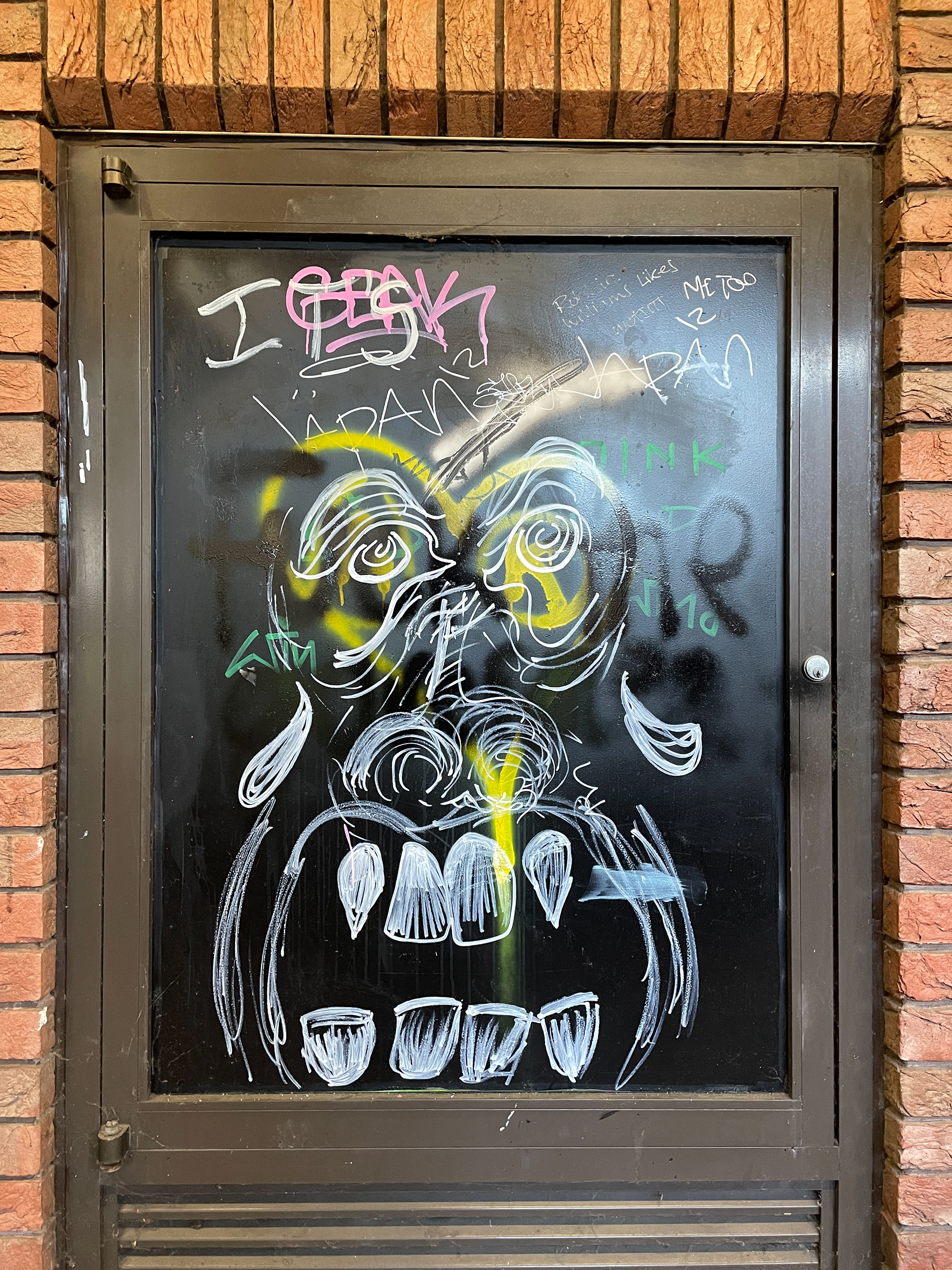
In the edit I decided to add a distorted effect to the video whilst it pans in and out quickly. In my opinion it catches the eye, the Off White logo it edited over the top and also as part of the graffiti, which wouldn't be spotted unless pointed out.
After seeing Julian's editorial shots of her friend doing a kick, I had a brainwave of turning it into a gif which loops her kicking. In my opinion it works very well, I added a pixel distorted effect to the video inspired by the aesthetic of "Imaginary TV".
Off Zine logo
Looking at their other Instagram icons for an idea of the design.
off__zine Instagram
A visual platform who's main consumers are the younger generation seems perfect for
off zine to reach the target audience.
A quote by Virgil from his lecture at RISD features in the bio "Perfectionism doesn't advance anything". To me this was rule breaking as typically whenever a luxury brand does produce anything it must be perfectionist, this quote highlights that perfectly.
Off__Zine playlist
Featuring a range of hip-hop/rap artists who are innovators in their own right. The link is easily shared via QR code on social media, making the zine more sensory.